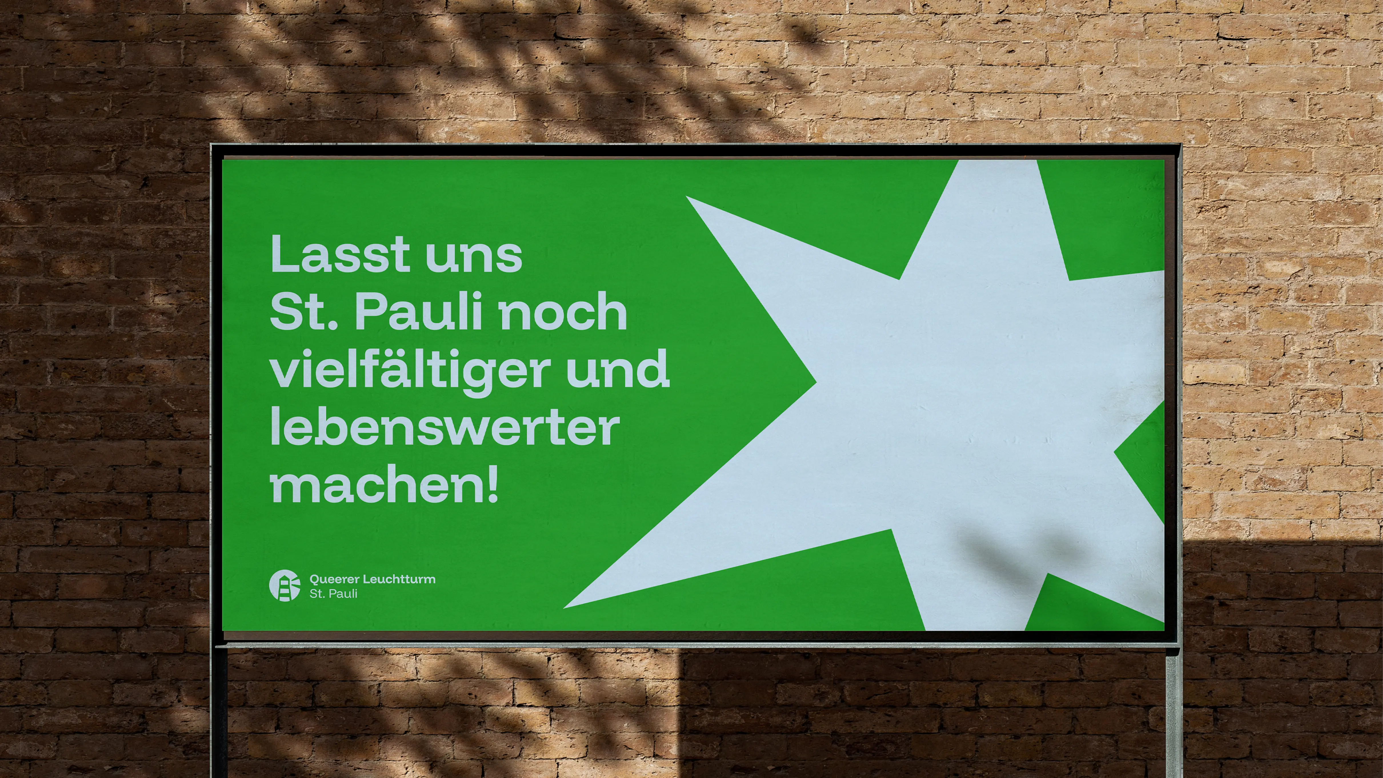
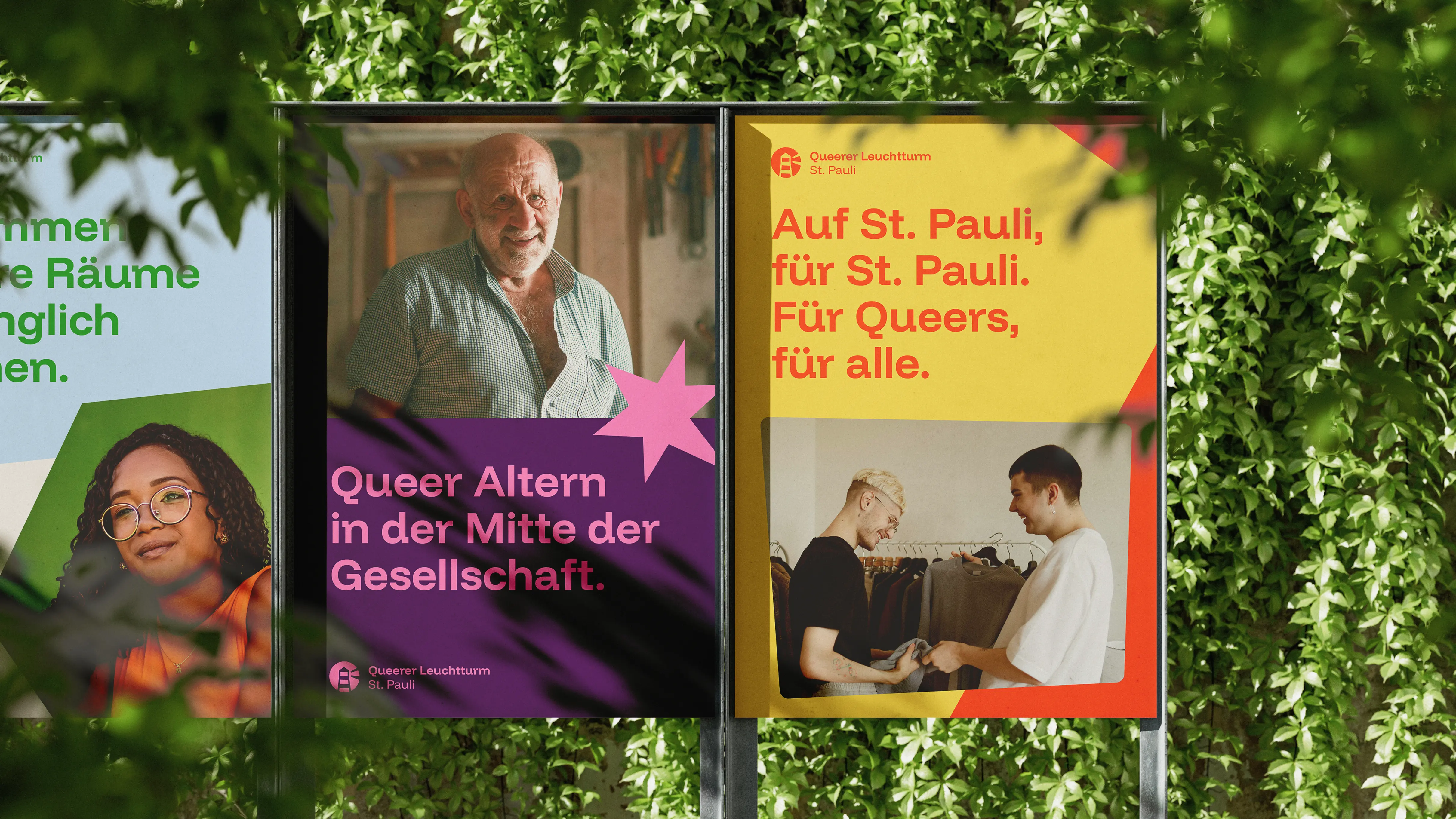
The Queerer Leuchtturm (Queer Lighthouse) emerged during the pandemic from the idea of a „Chosen Village”. The project is intersectional and inclusive, and is intended to serve as a laboratory for new approaches to housing, construction and neighbourhood development. Born in St. Pauli, the Queer Lighthouse addresses important social issues such as queer housing and culture, as well as queer ageing and care — all underpinned by scientific research.
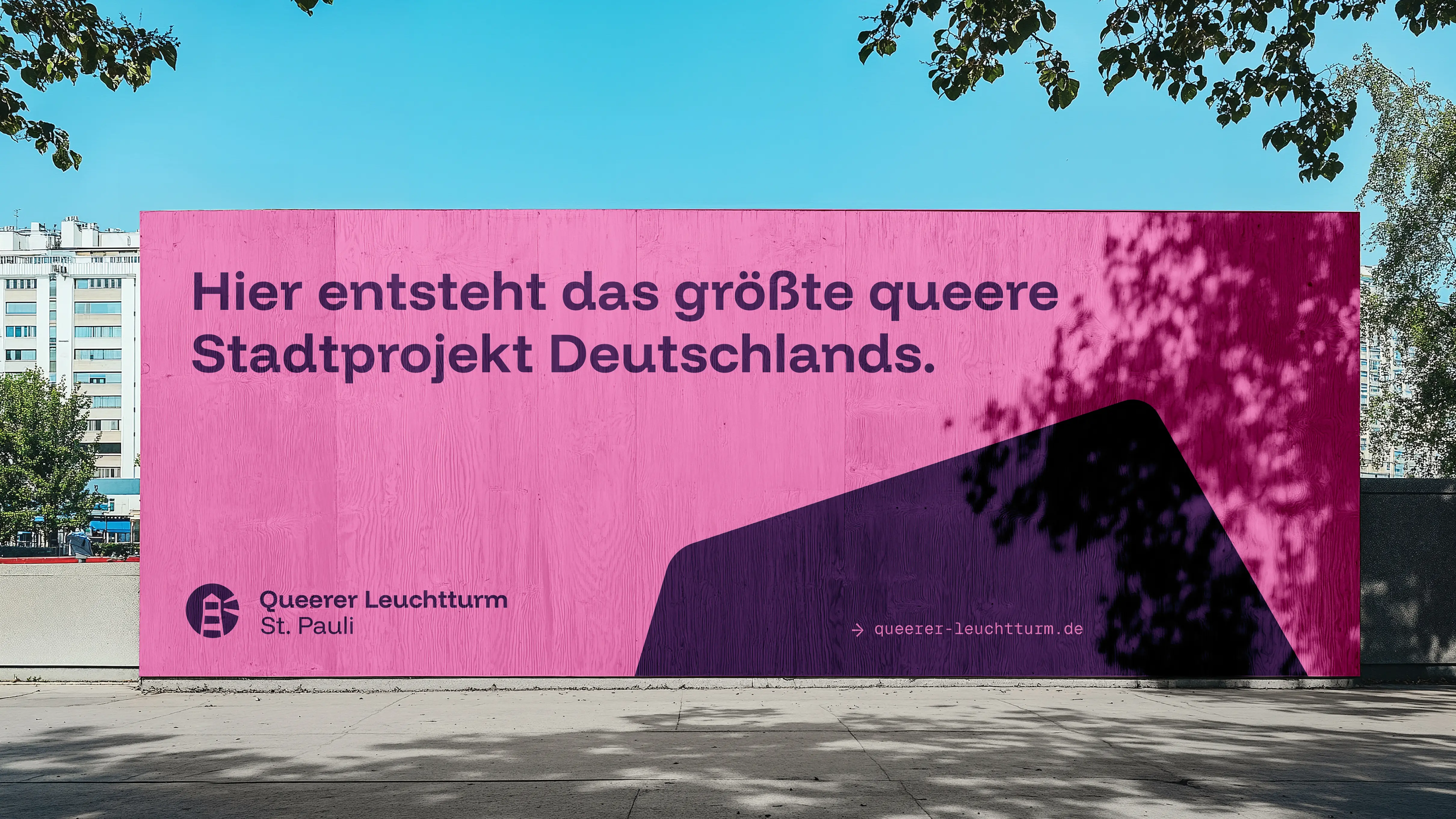
As part of our 2025 pro bono initiative, we created a brand identity that questions the concept of conventional space and highlights the boundlessness of love and social norms.
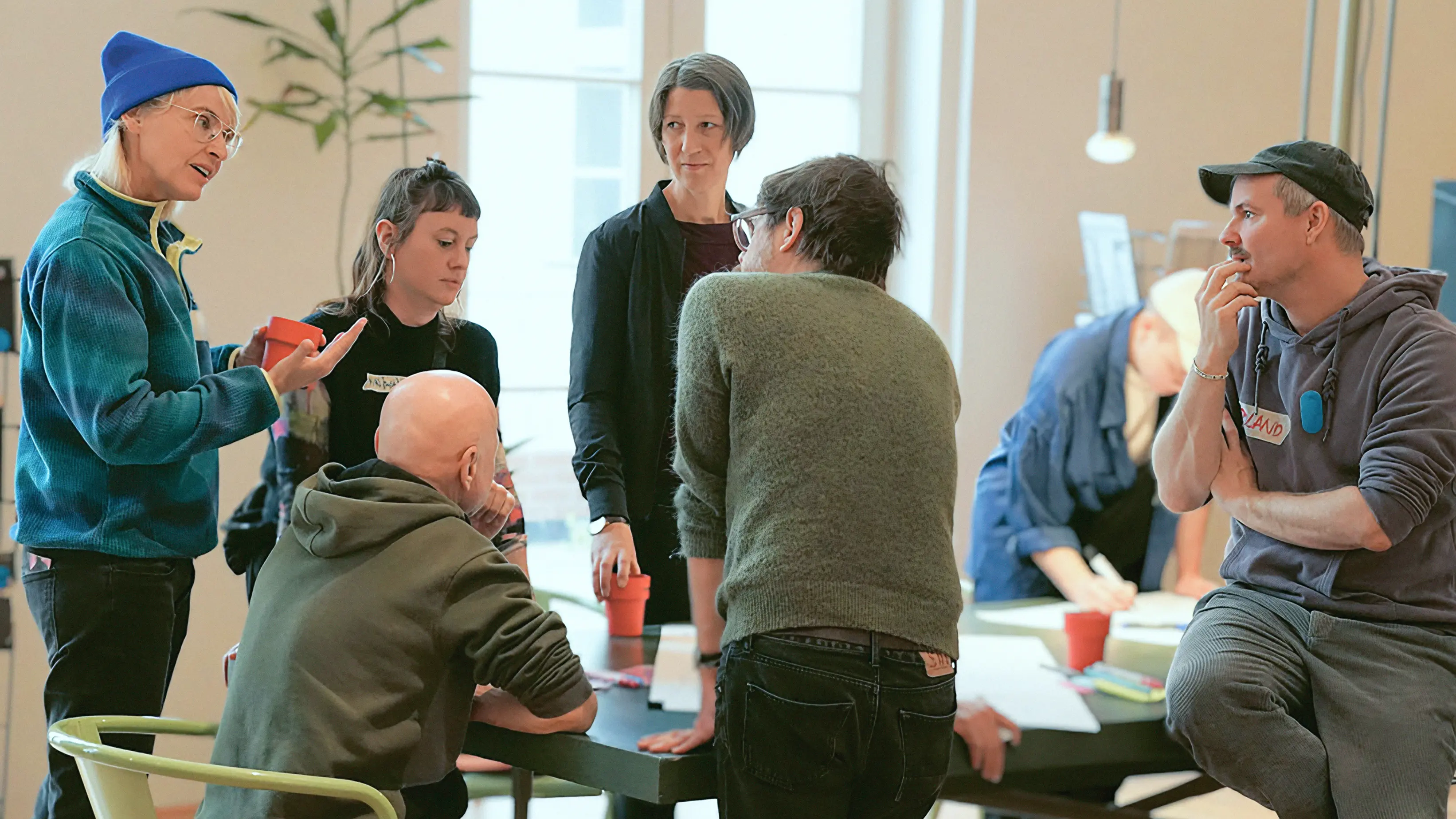
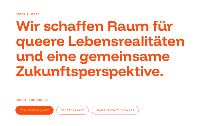
At a joint session, the association’s strategic foundations were established, and its purpose and brand values were defined.
This well-established Hamburg hub for social, sexual and gender diversity also runs its own workshops and events, bringing people together to generate ideas, exchange views and raise awareness through participation, as shown on the right at the Queer Future Lab at MK&G Hamburg.
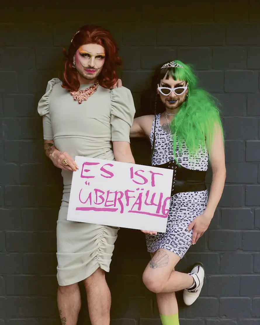
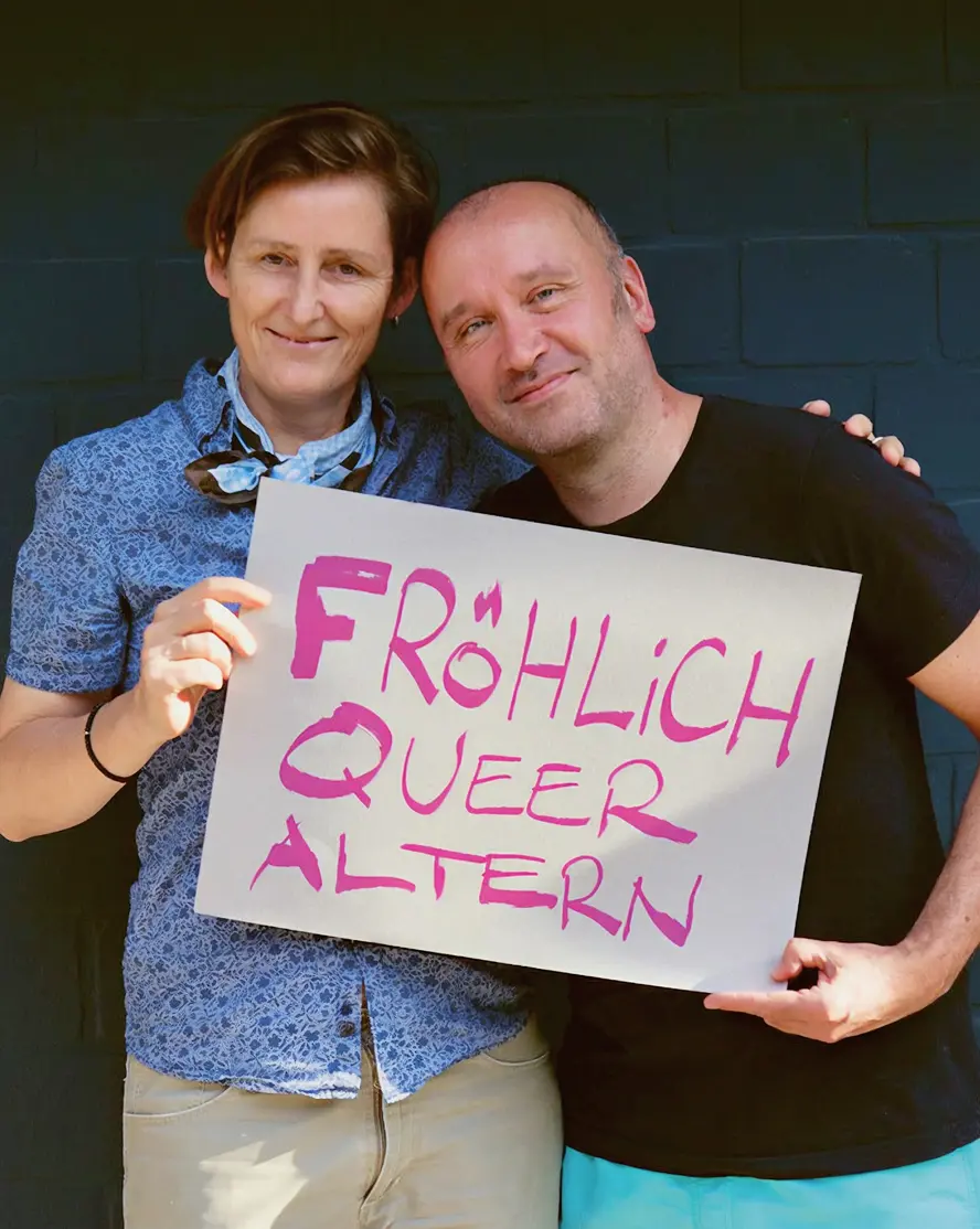
Perfectly imperfect: The new logo and icons feature imperfect curves and lines that reinforce the brand’s unconventional character, and are characterised by modern simplicity and scalability.
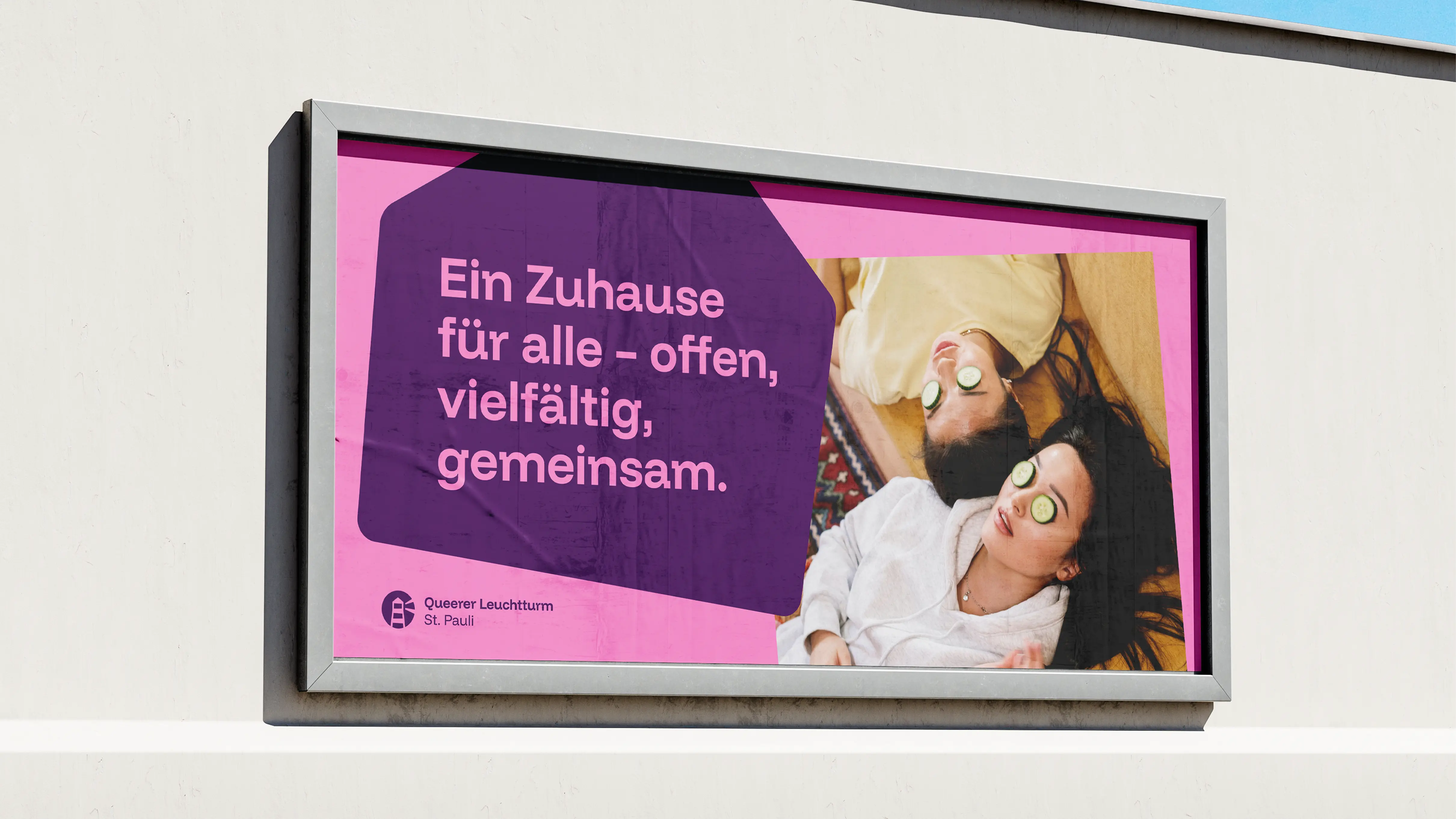
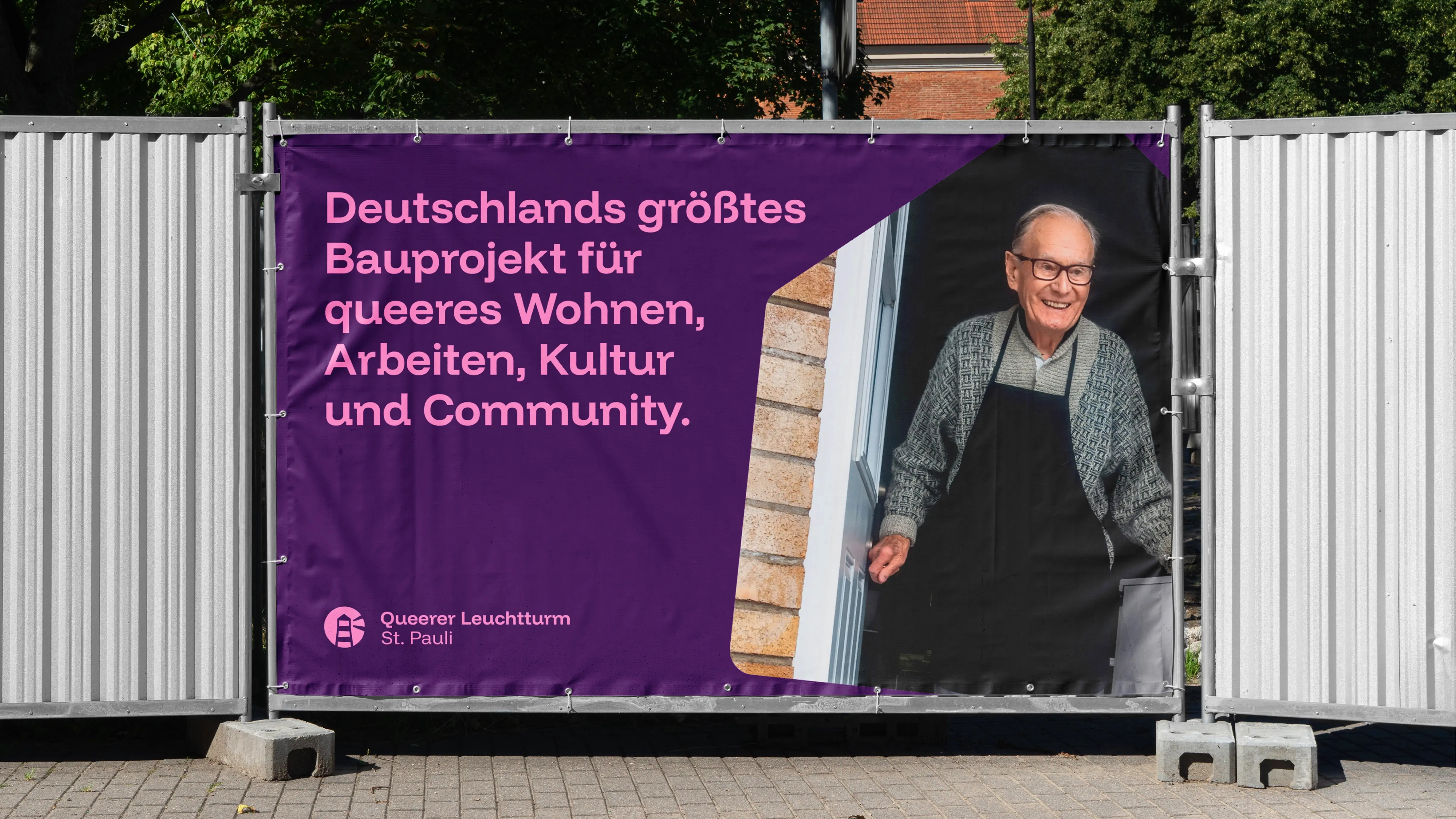
A key consideration in creating the right identity was to avoid falling into visual clichés. The brand therefore shines in distinctive, bold colours that appear in colour pairings and embody maximum visibility.

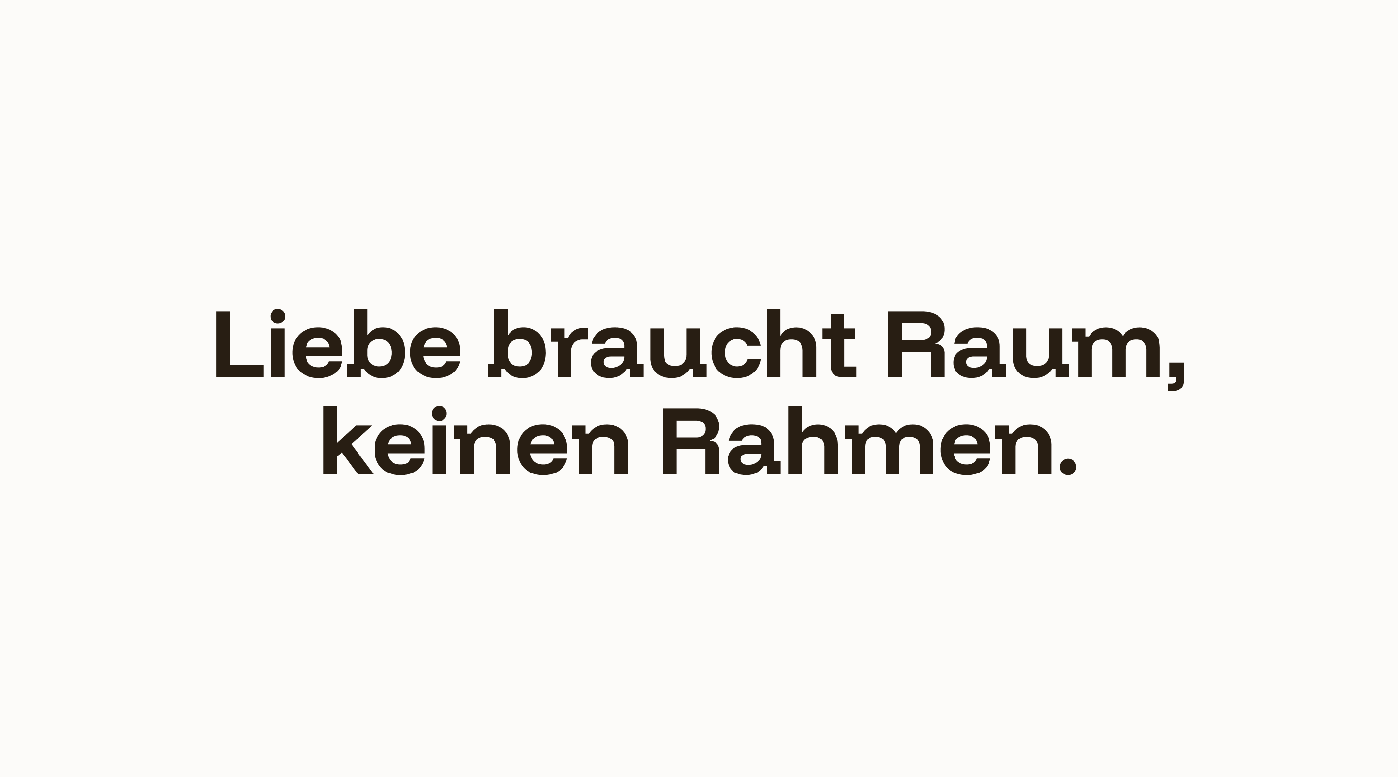






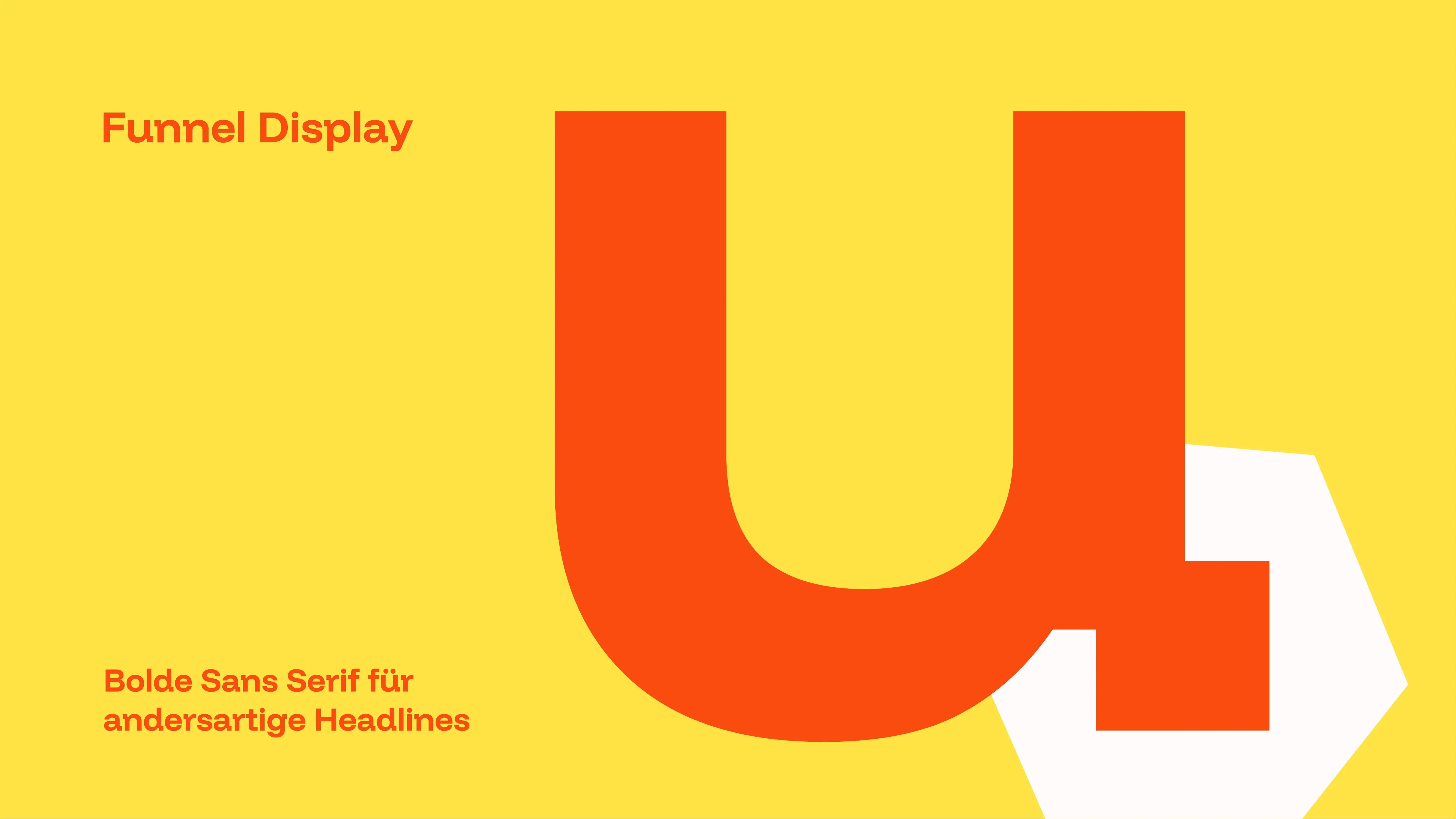
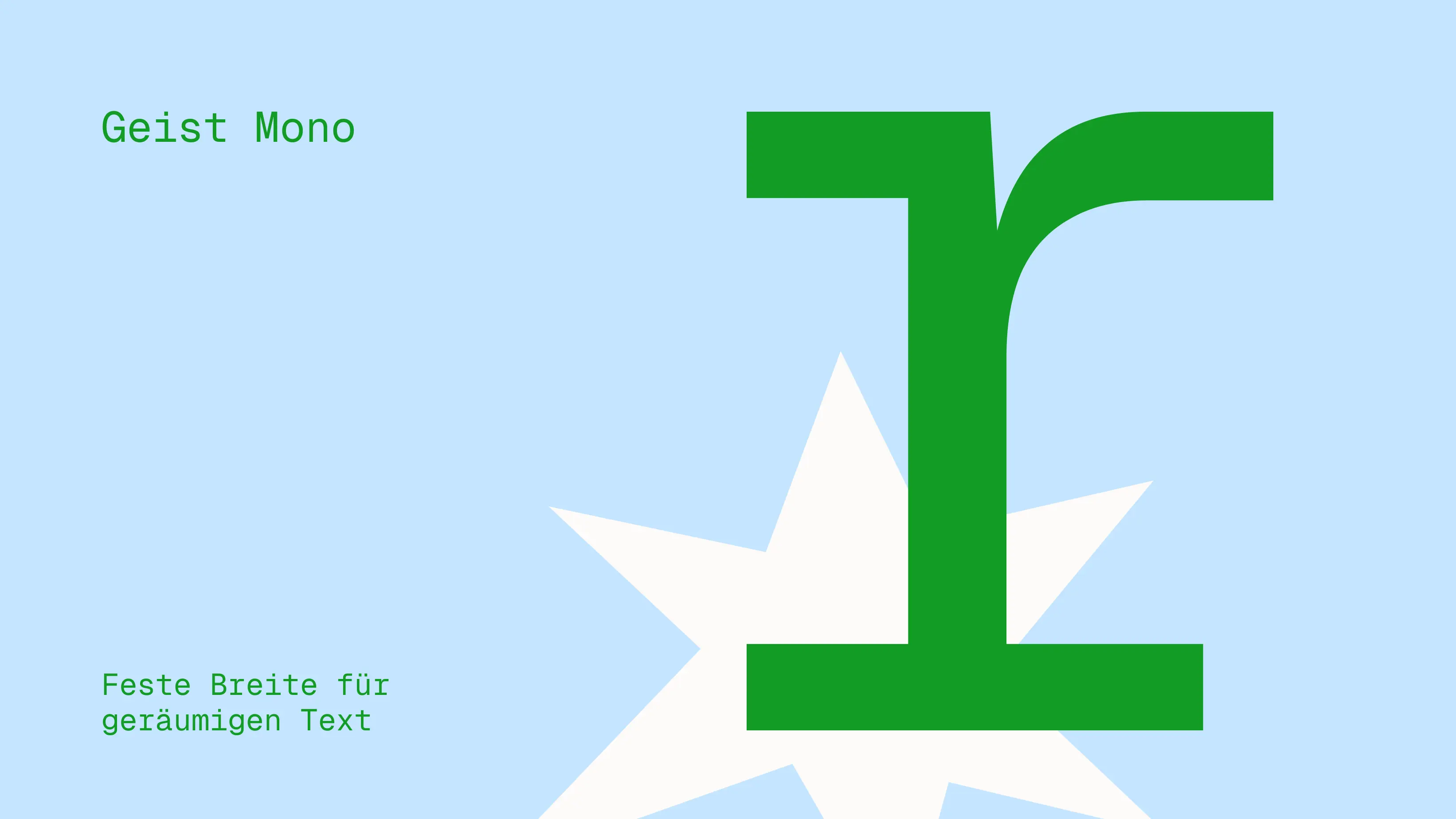
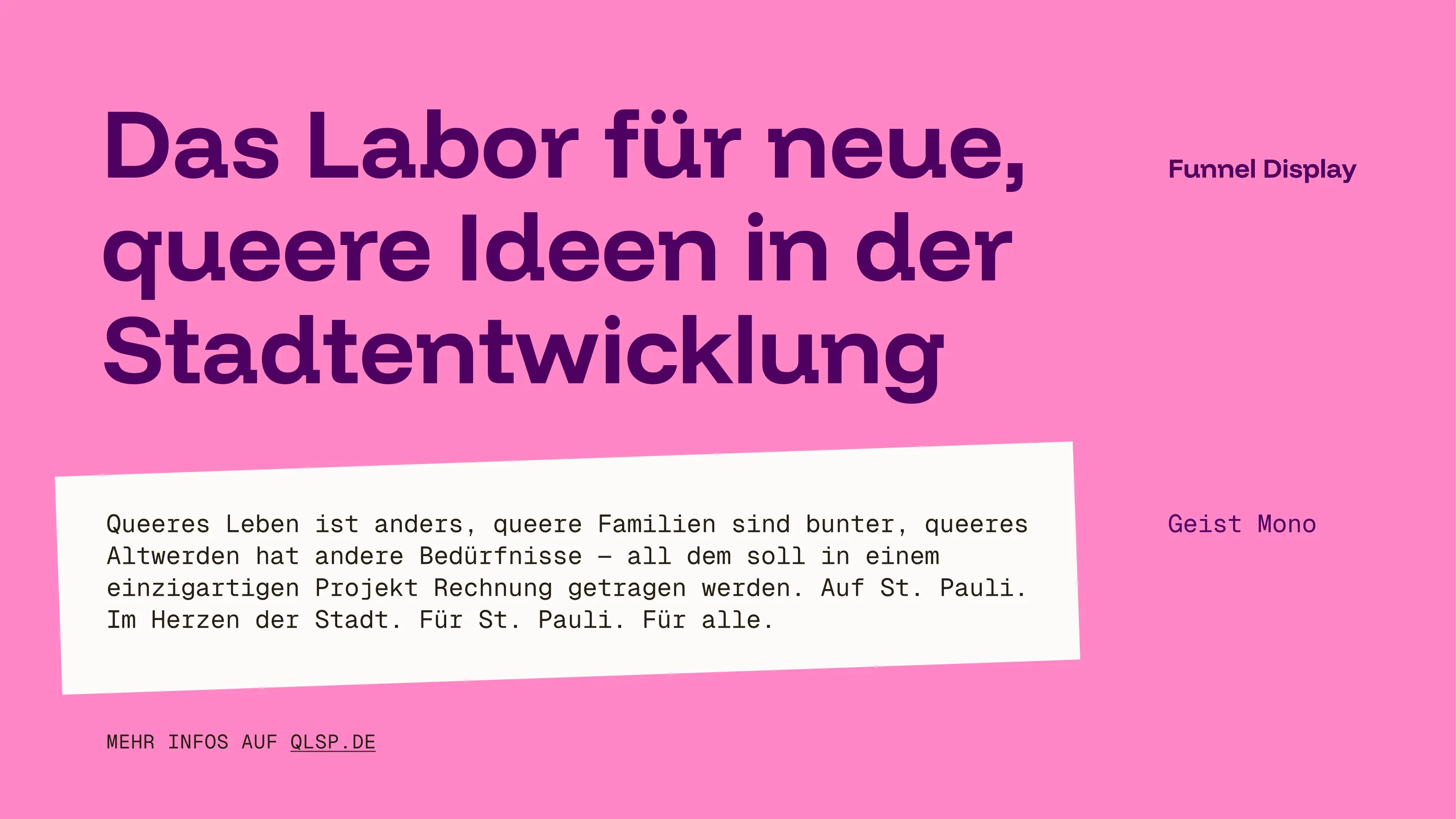
The typography gives the brand design a sense of stability and a touch of calm that complements the bold branding without making it feel too generic. The design principle is characterised by the use of solid shapes, which can help categorise the different areas. Starting from a conventional rectangular space, unconventional spatial forms were created to highlight the brand’s diversity and show that love can, and should, exist in all shapes and colours.