JUNGLÜCK was founded on the idea of developing pure, natural and effective cosmetics. In a world full of promises, the brand is a trusted companion in skincare. It champions authenticity and the power to make your own choices: its foremost aim is to equip customers with the knowledge to make informed decisions about their skincare and, with its diverse, high-quality products, create their own exclusive moments of wellbeing in everyday life.
Since its founding in 2018, JUNGLÜCK has helped consumers understand their own skin’s needs and choose the products best suited to them. With a stronger focus on exclusivity and sharing knowledge on an equal footing, the brand is now repositioning itself to continue meeting its target audience’s needs as effectively as possible.
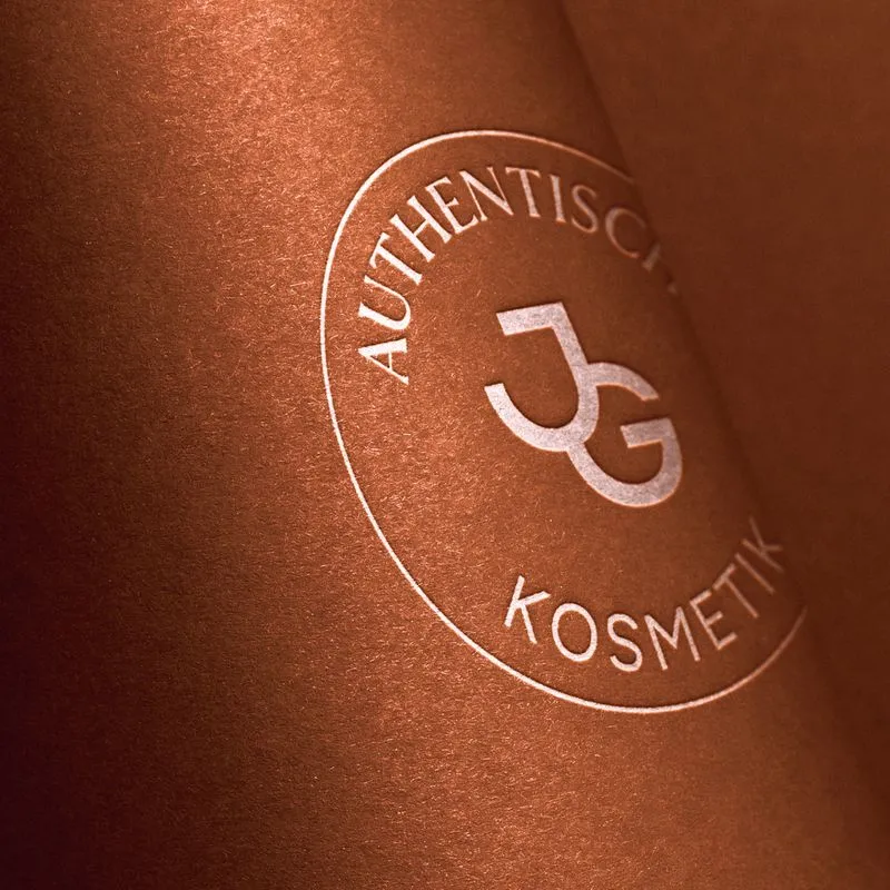
During a branding sprint with the project team, the existing brand elements were reviewed from the ground up, fine-tuned and, where necessary, completely overhauled.
The results speak for themselves: alongside updated brand values, a core target audience was clearly defined, and a punchy brand story was written to express JUNGLÜCK’s mission and vision even more clearly.
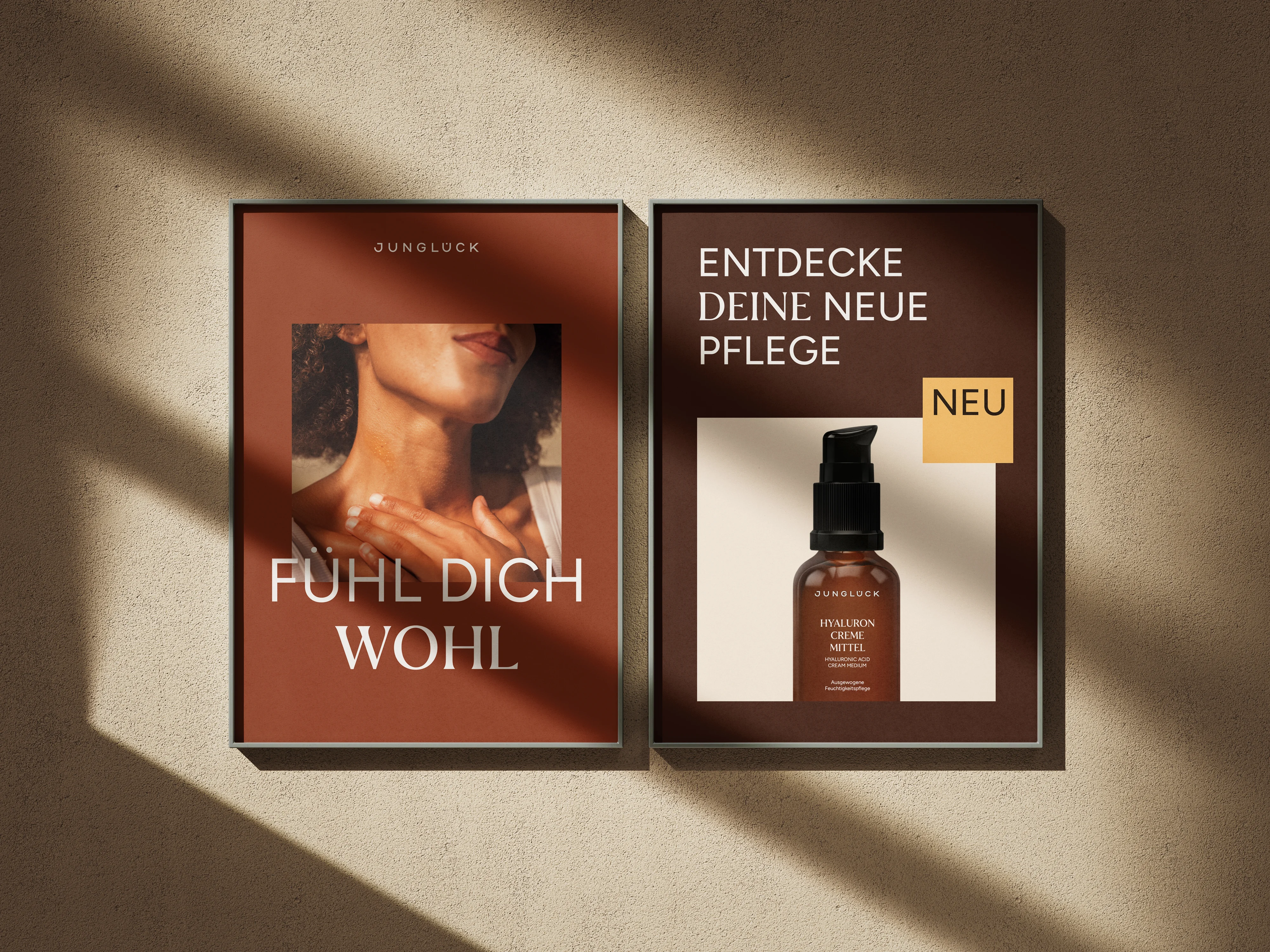
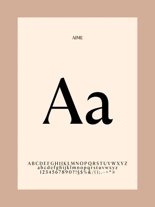
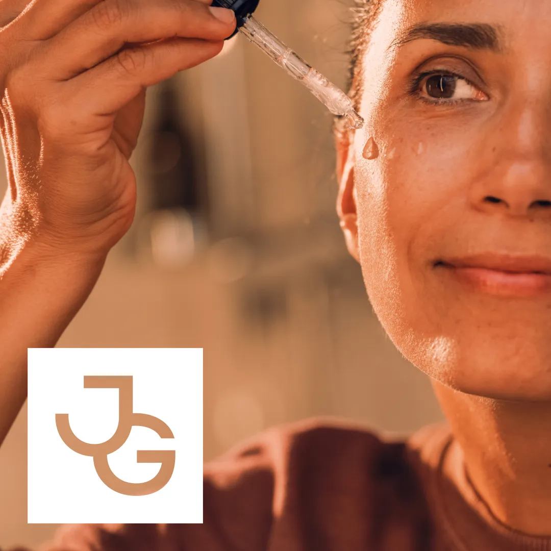
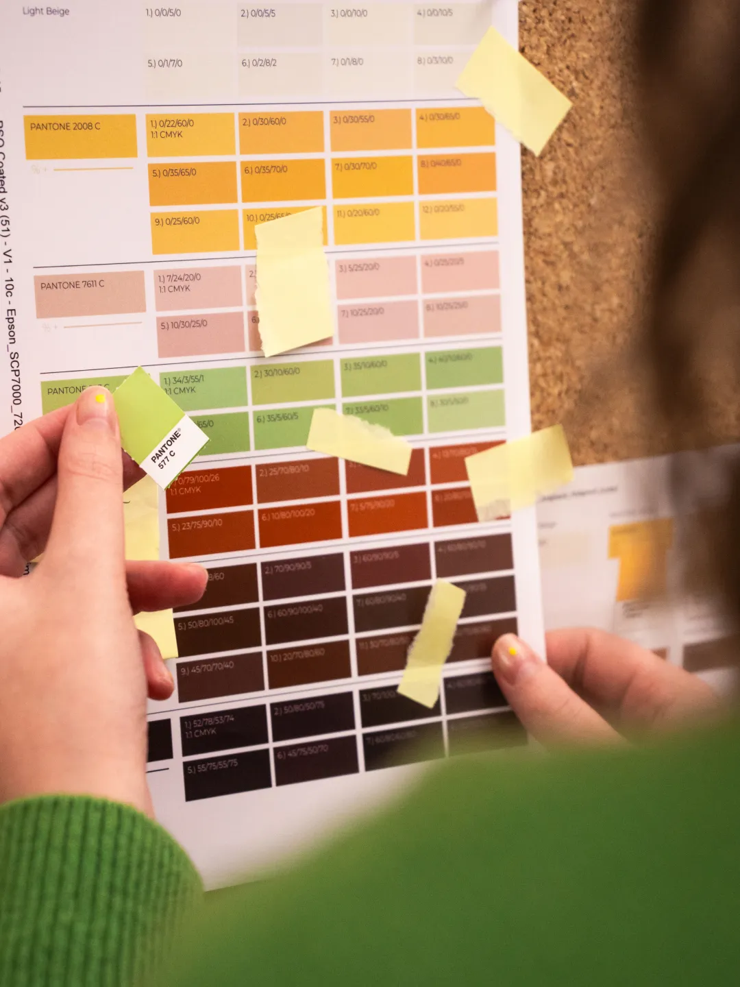
As part of the brand’s development, the pictorial mark has been refined to create a more exclusive look. The new design concept takes its cue from the dots above the Ü in the wordmark, offering flexibility across different media and selling points. An elegant, timeless mix of typefaces reinforces the brand’s identity, while a natural, warm colour palette reflects and complements the hues of its iconic brown glass bottle.
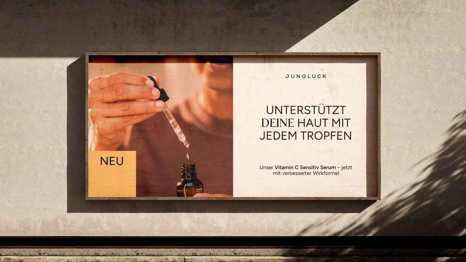
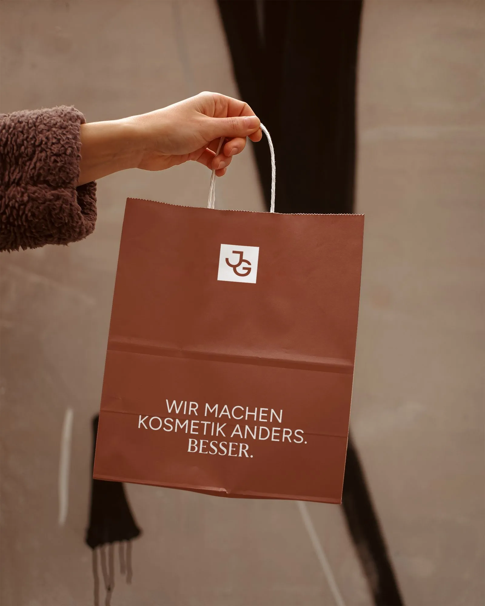
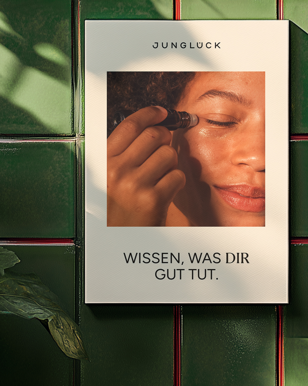
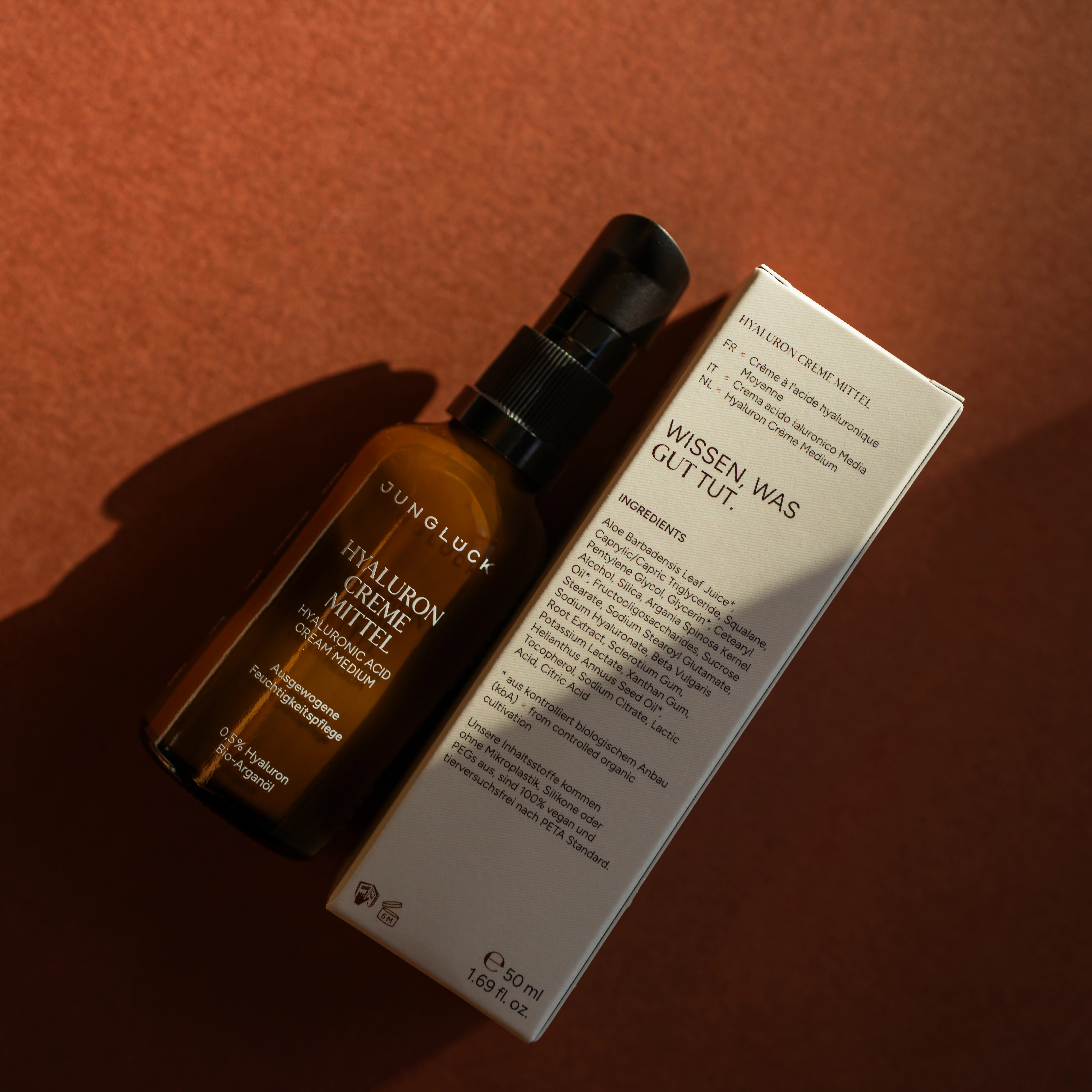
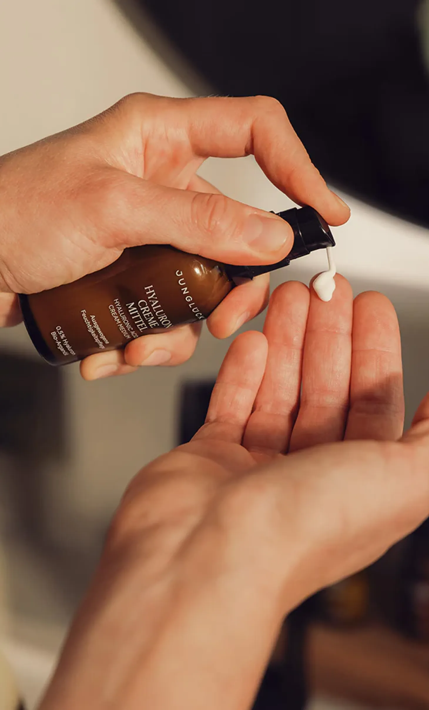
The packaging was also refined as part of the rebrand. Here, too, the focus was on carefully improving what was already there, with the iconic brown glass bottle retained as a central feature by which the brand is recognised.
The structures and layouts of the outer packaging now follow the new square design principle, creating a sense of order. Elegant typography reinforces the modernised brand identity and gives the packaging a timeless look.
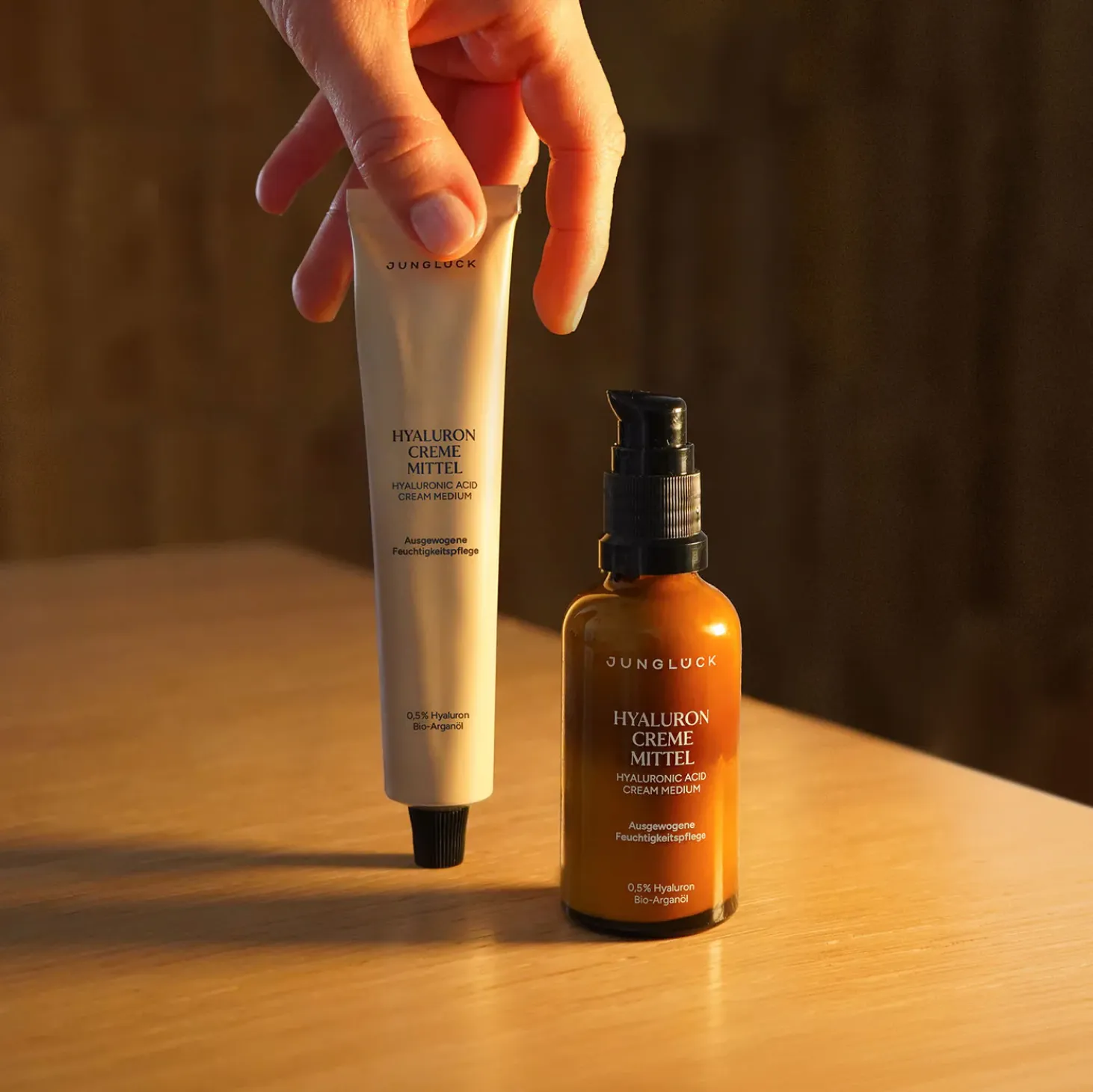
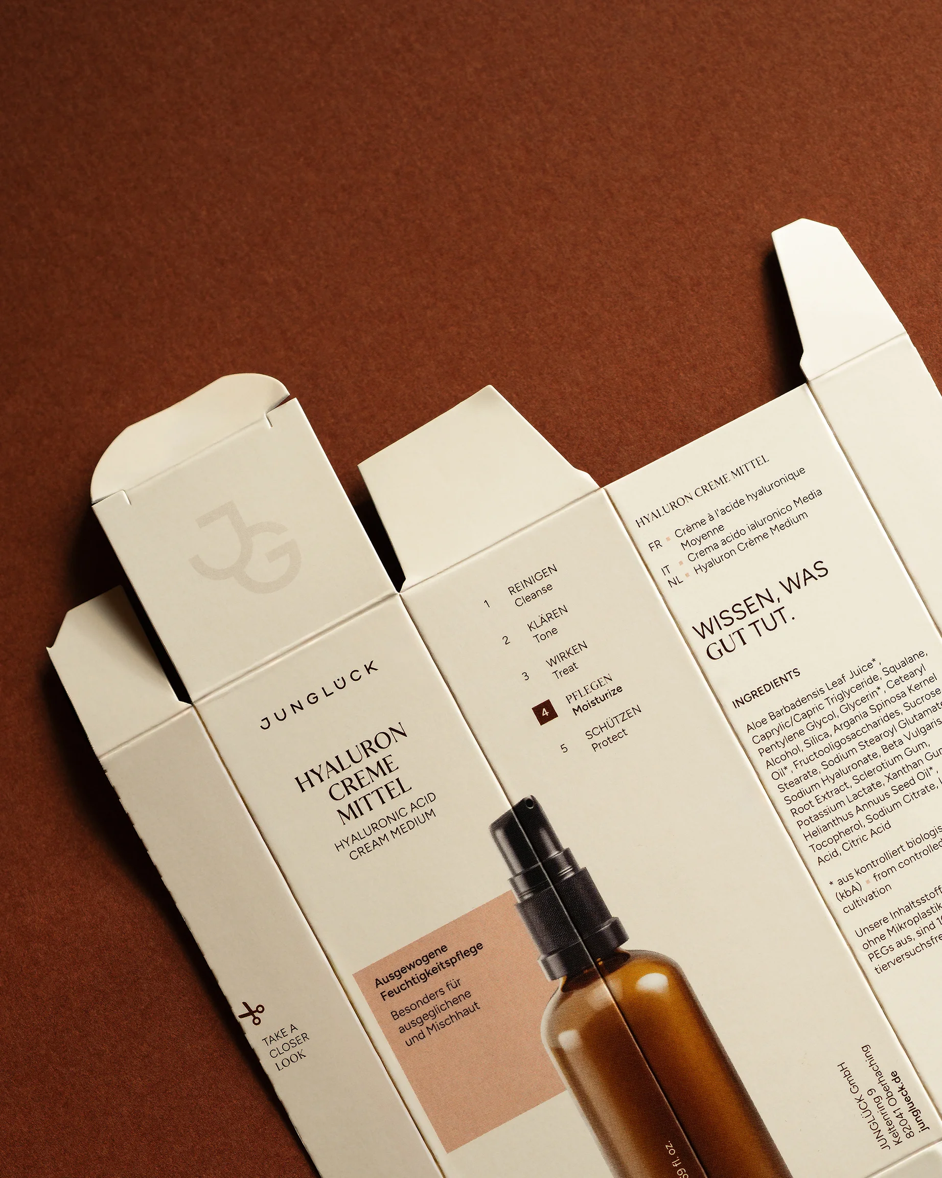
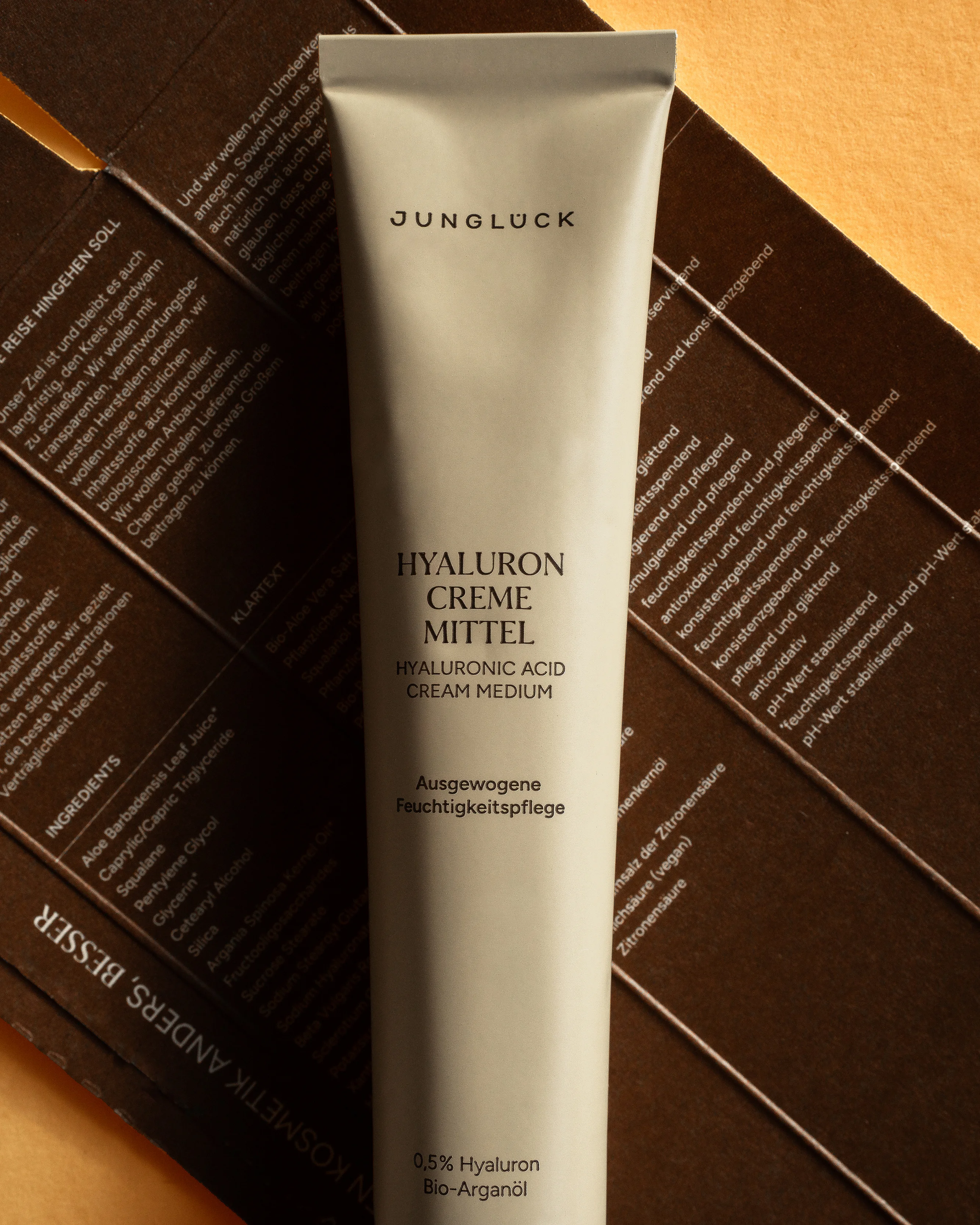
A fold-out structure with printing throughout the inside makes the outer packaging an information source in its own right, removing the need for a conventional package leaflet. Opening it becomes a subtly playful, informative experience of the brand.
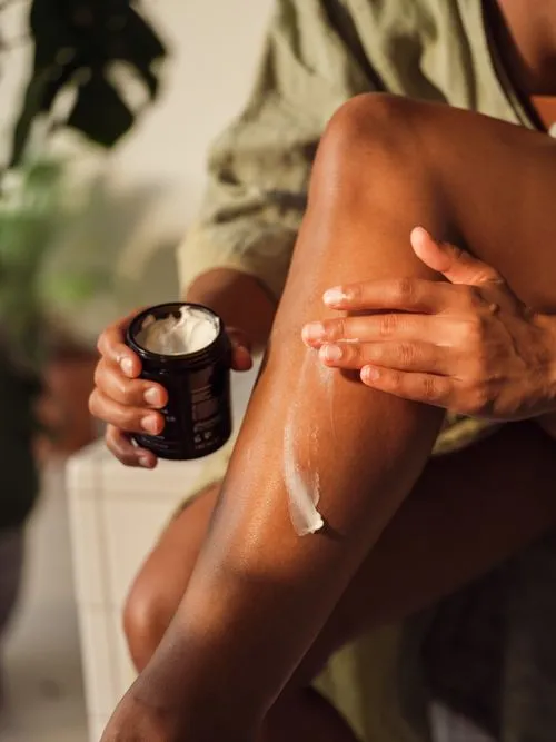
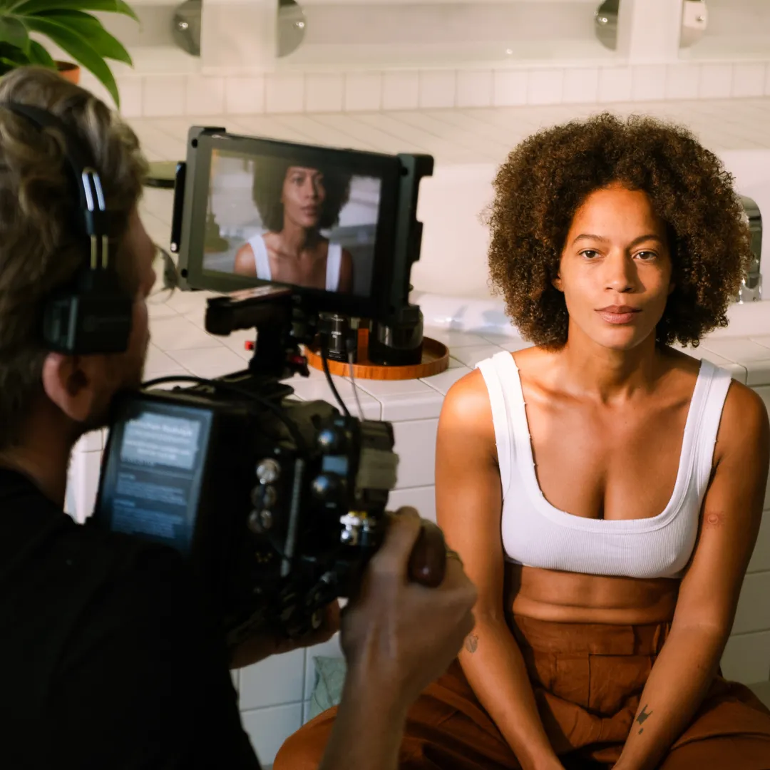
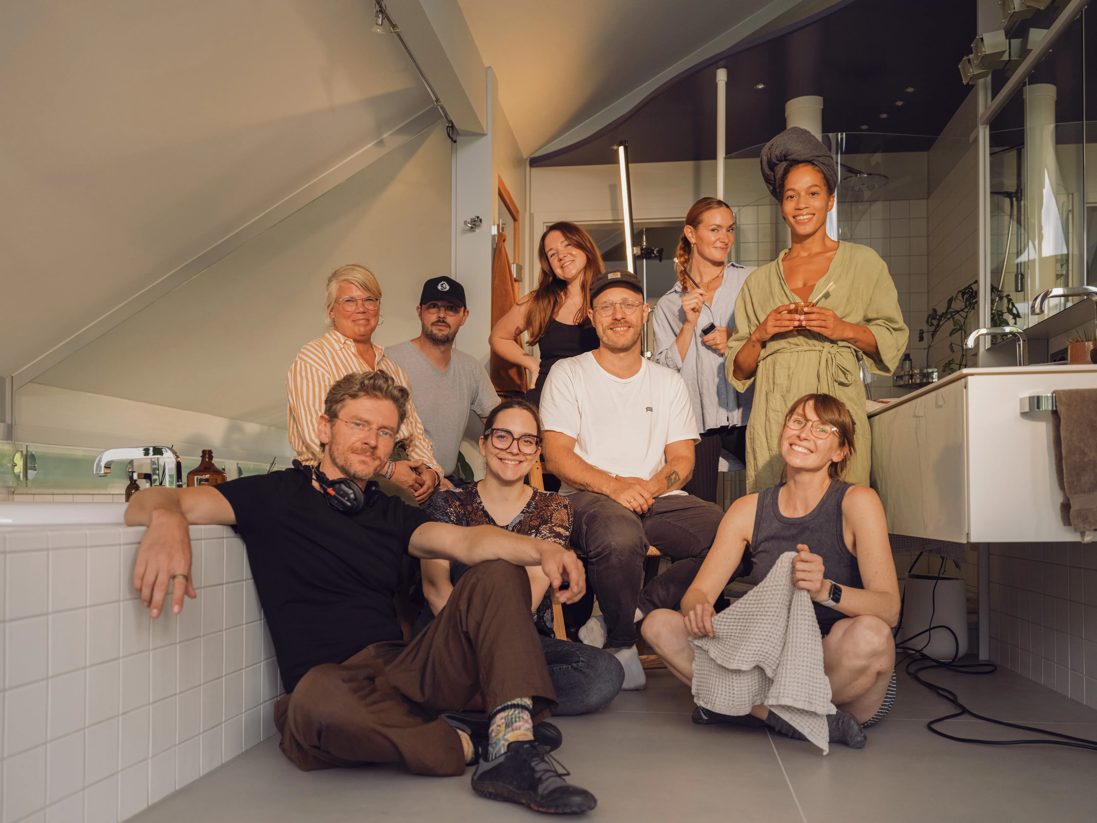
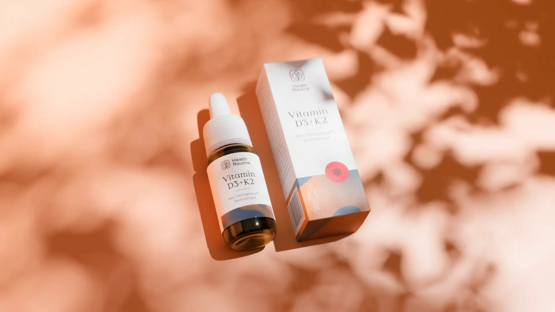
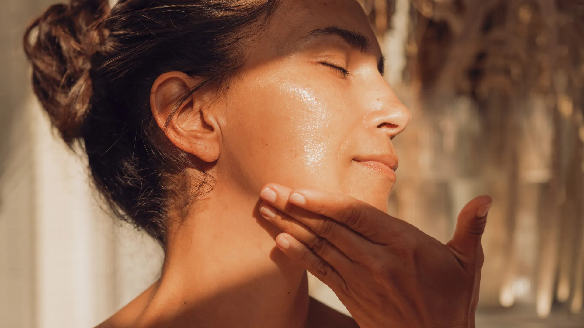
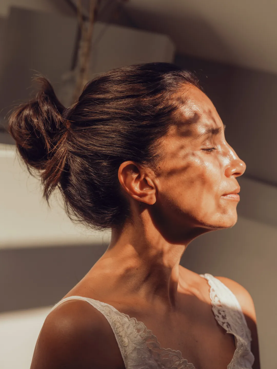
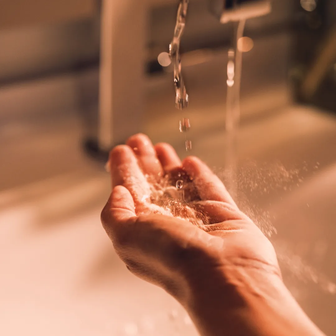
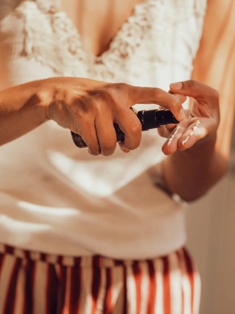
The newly developed visual language brings the warm feeling conveyed by JUNGLÜCK straight into its customers’ bathrooms and living spaces. This creates a cosy atmosphere that can be reflected in every season. In this way, the brand becomes a welcome part of its customers’ everyday lives. The project was carried out in collaboration with the team led by photographer Mareen Fischinger Mareen Fischinger and videographer Krischan Rudolf.