Since their founding in 2013, the Hamburg Towers have stood for community, commitment and determination. With Veolia becoming the new naming partner of the professional division, the opportunity arose to modernise the Towers’ entire brand design: making it more digital, dynamic and human, without losing their values or character. Development, diversity, enthusiasm and self-confidence are central to the new design and will be reflected even more strongly in the visual identity going forward.
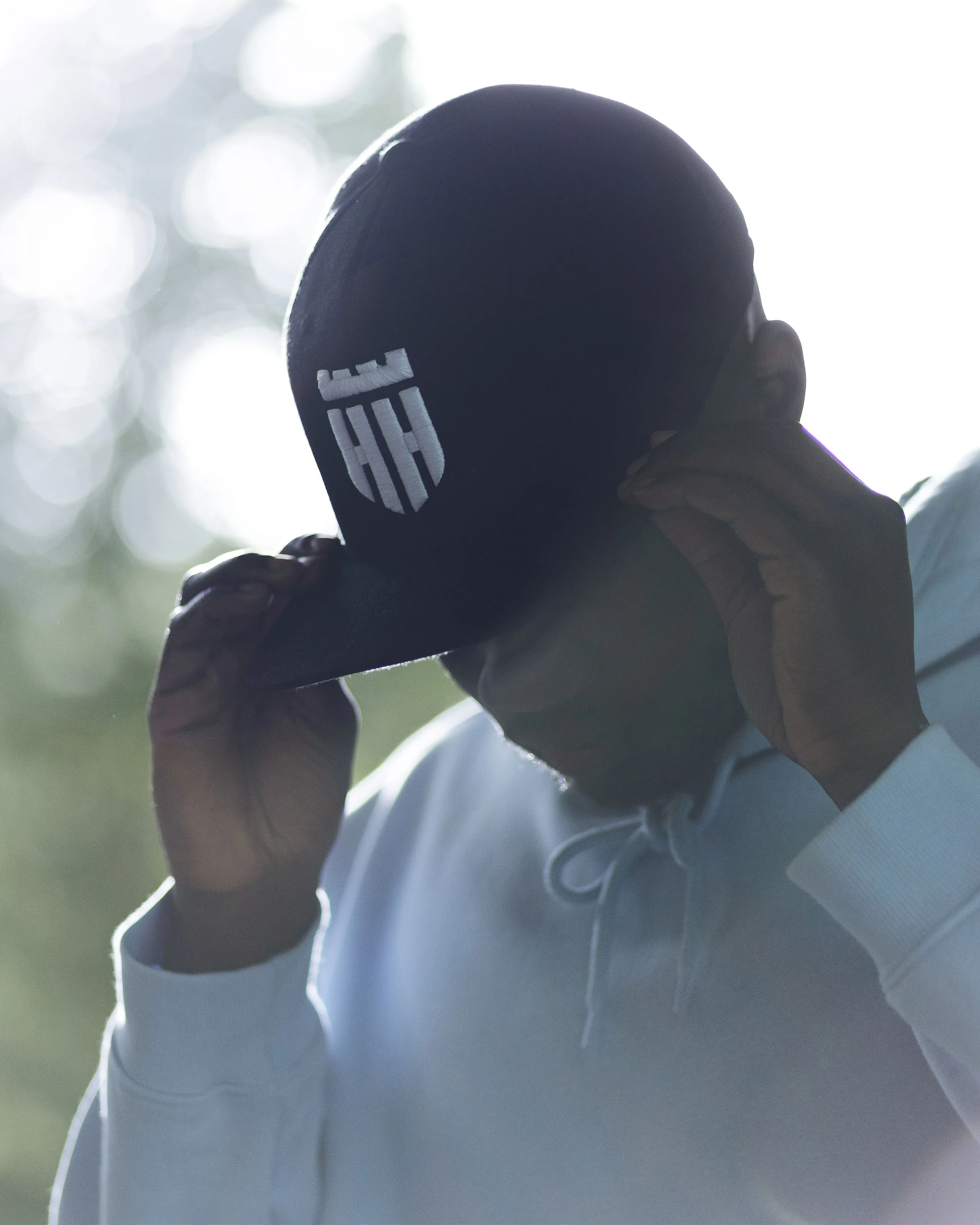
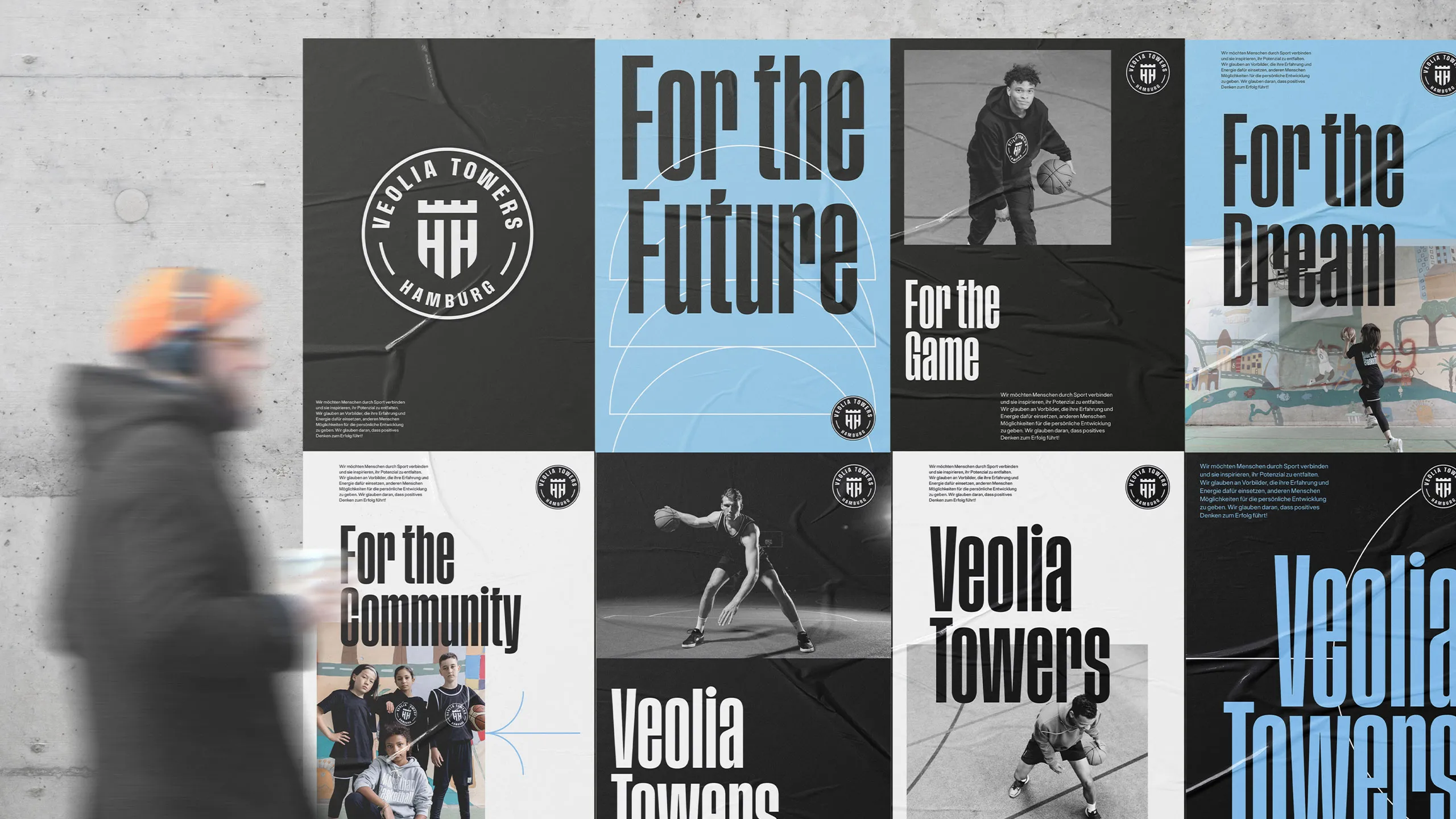
At the heart of the new brand design is the emblem, which references the original logo. Its form reflects both the city and the club. The clarity of its visual language creates a symbol that conveys the club’s individuality in every context, while also serving as the basis for further sub-brands.
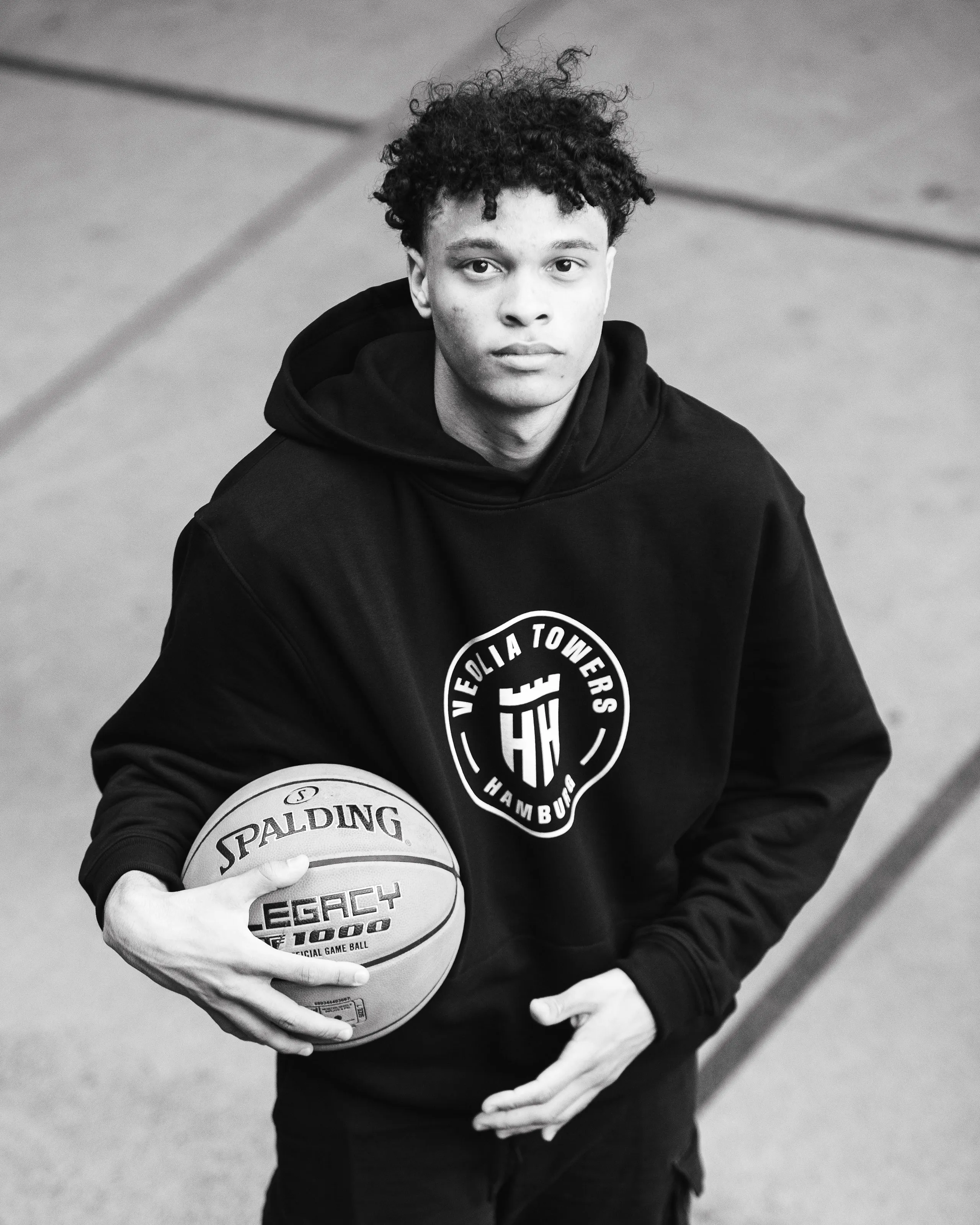
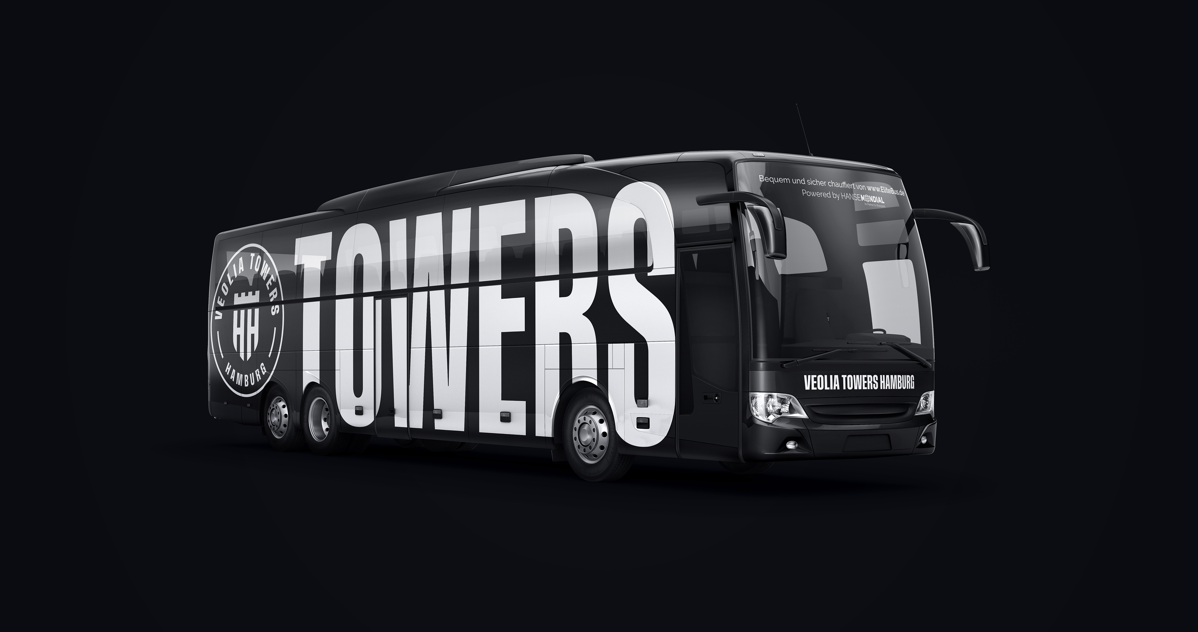
As the club’s professional division, the Veolia Towers use a special version of the logo – the badge. The connection to the club as a whole remains, while creating a visual distinction from grassroots sport.
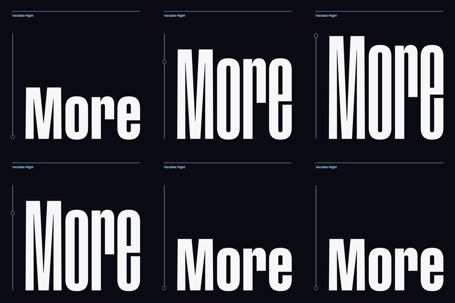
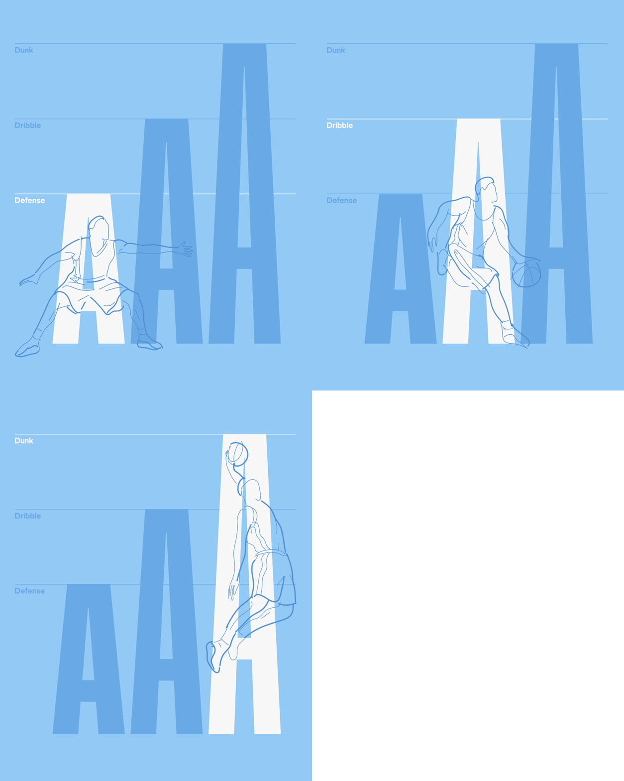
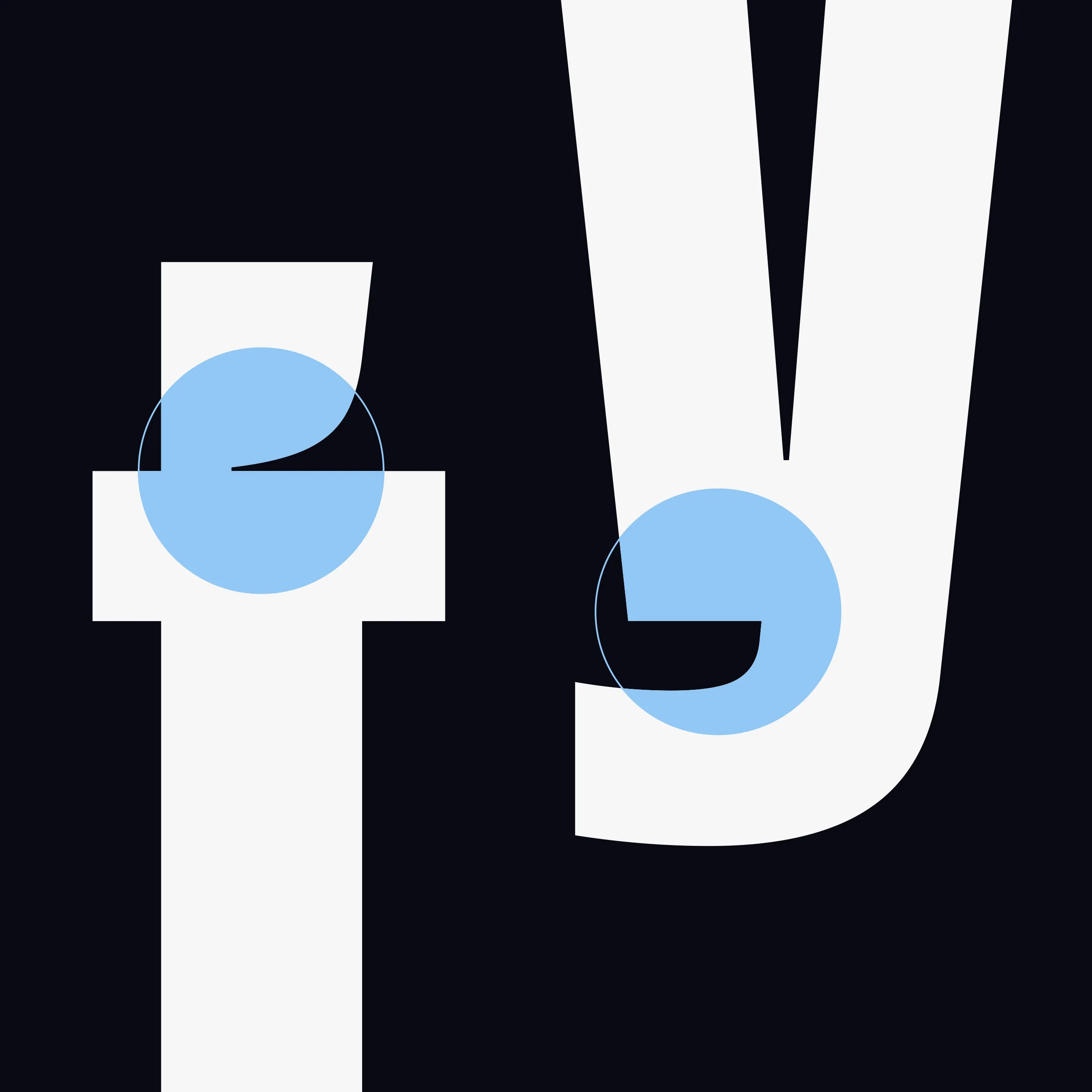
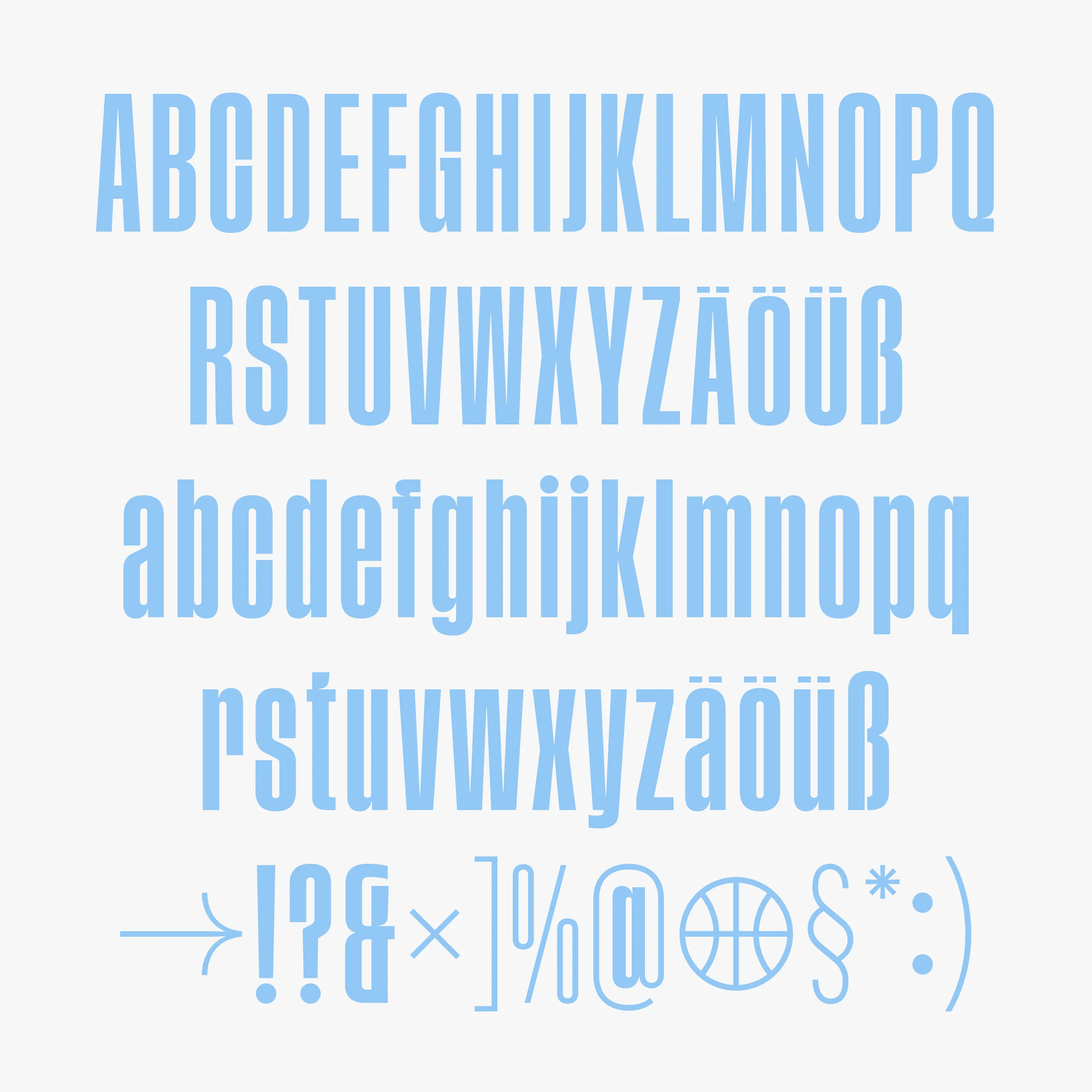
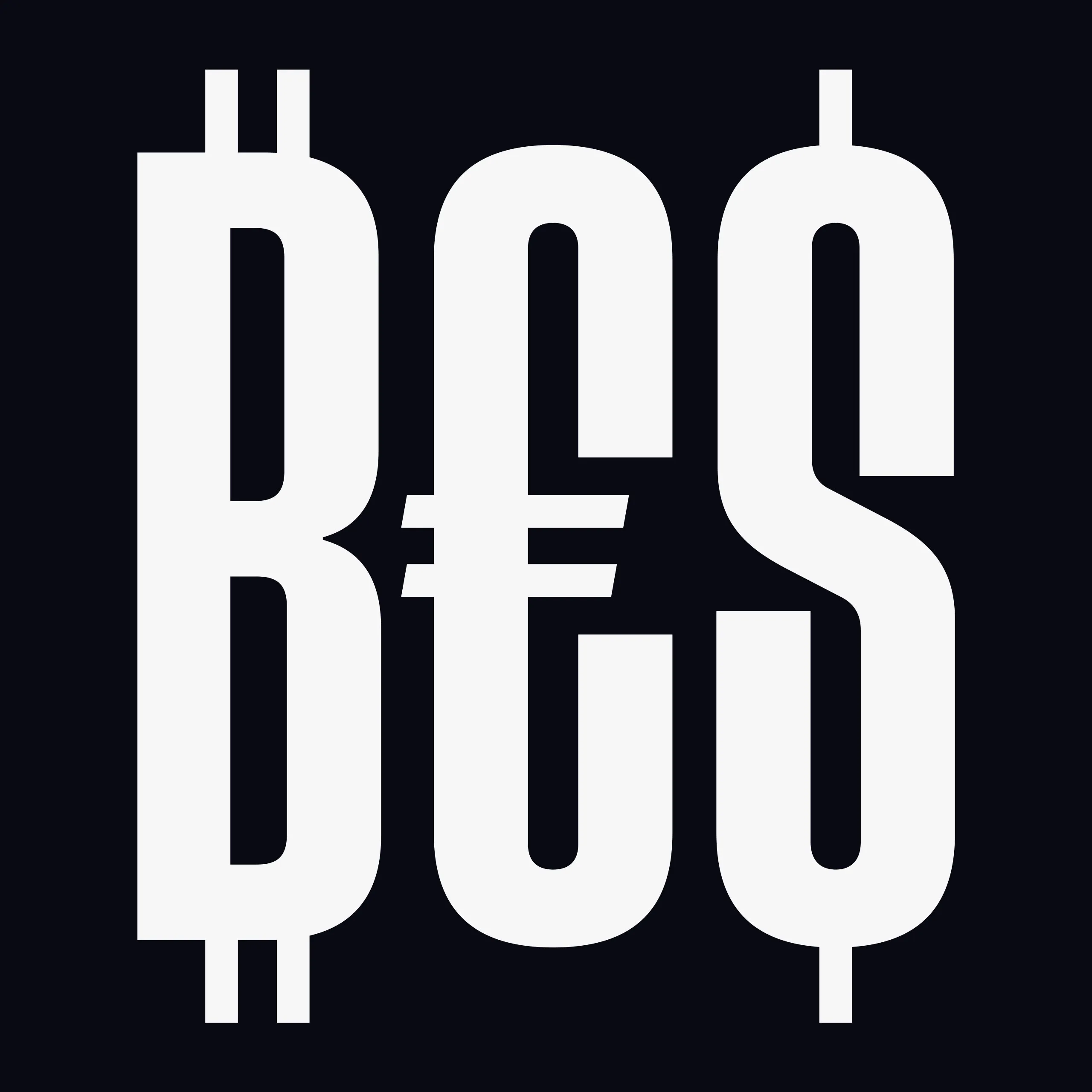
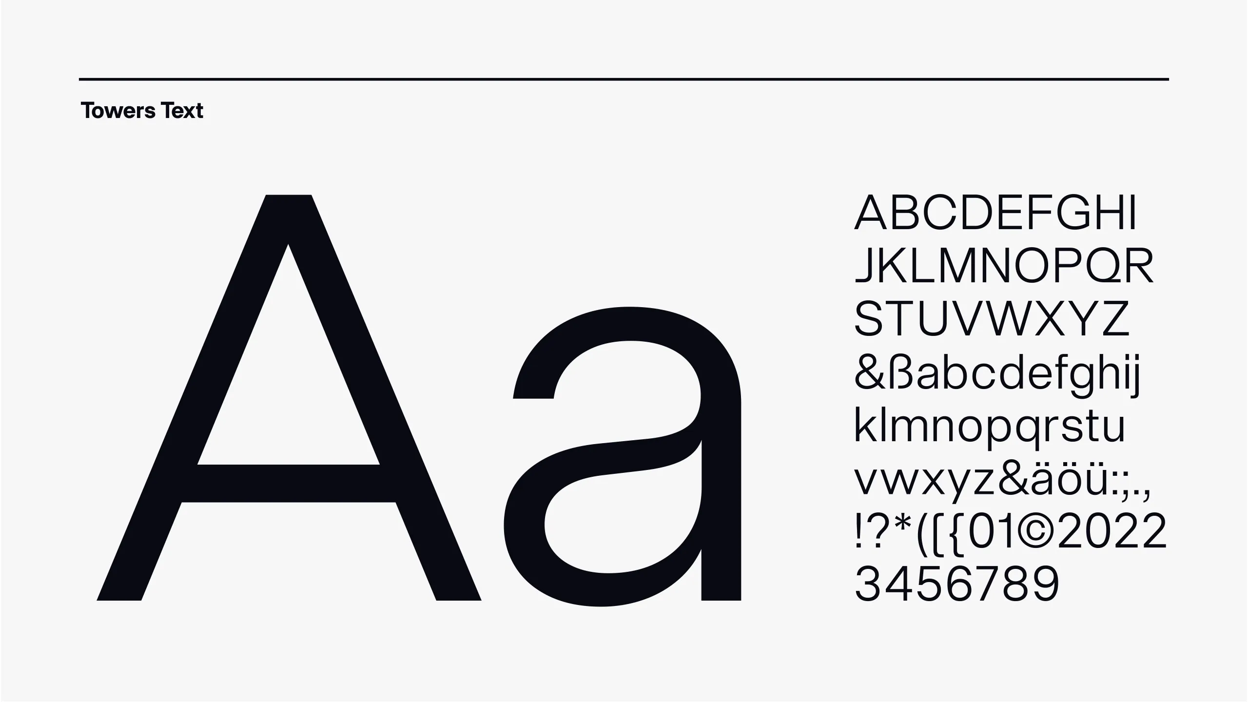
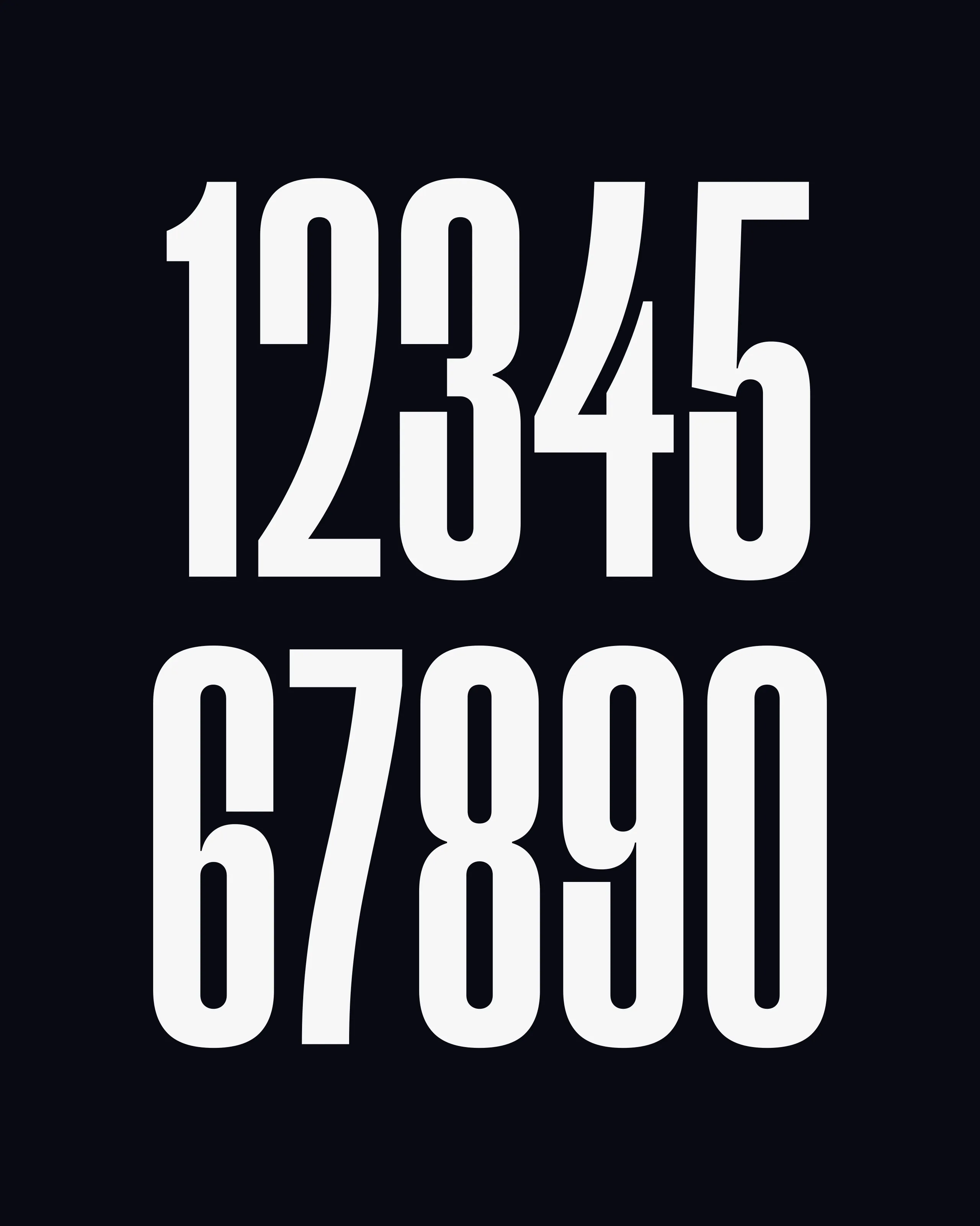
Alongside the emblem, the bespoke Towers typeface is one of the core elements of the design system. Its continuous variability allows for flexible, playful use which, combined with its distinctive visual language, makes it highly recognisable. Its fixed letter heights are modelled on different game situations: defence, dribble and dunk. Humanist touches give the clean, confident typeface a human character. Towers Display is complemented by Towers Text, which ensures optimum readability.
.jpg)
The typefaces provide direct access to design elements from the design system. These elements are derived from the shapes of the playing court and create a subtle connection to sport. Visually, their fine lines provide a contrast to the bold typography and reappear in the accents.
The refined colour palette draws on the previous corporate design. White, black and a distinctive blue remain the Towers’ brand colours. The black and white tones have been slightly tinted to optimise contrast in digital applications, while the characteristic blue feels warmer and more human.
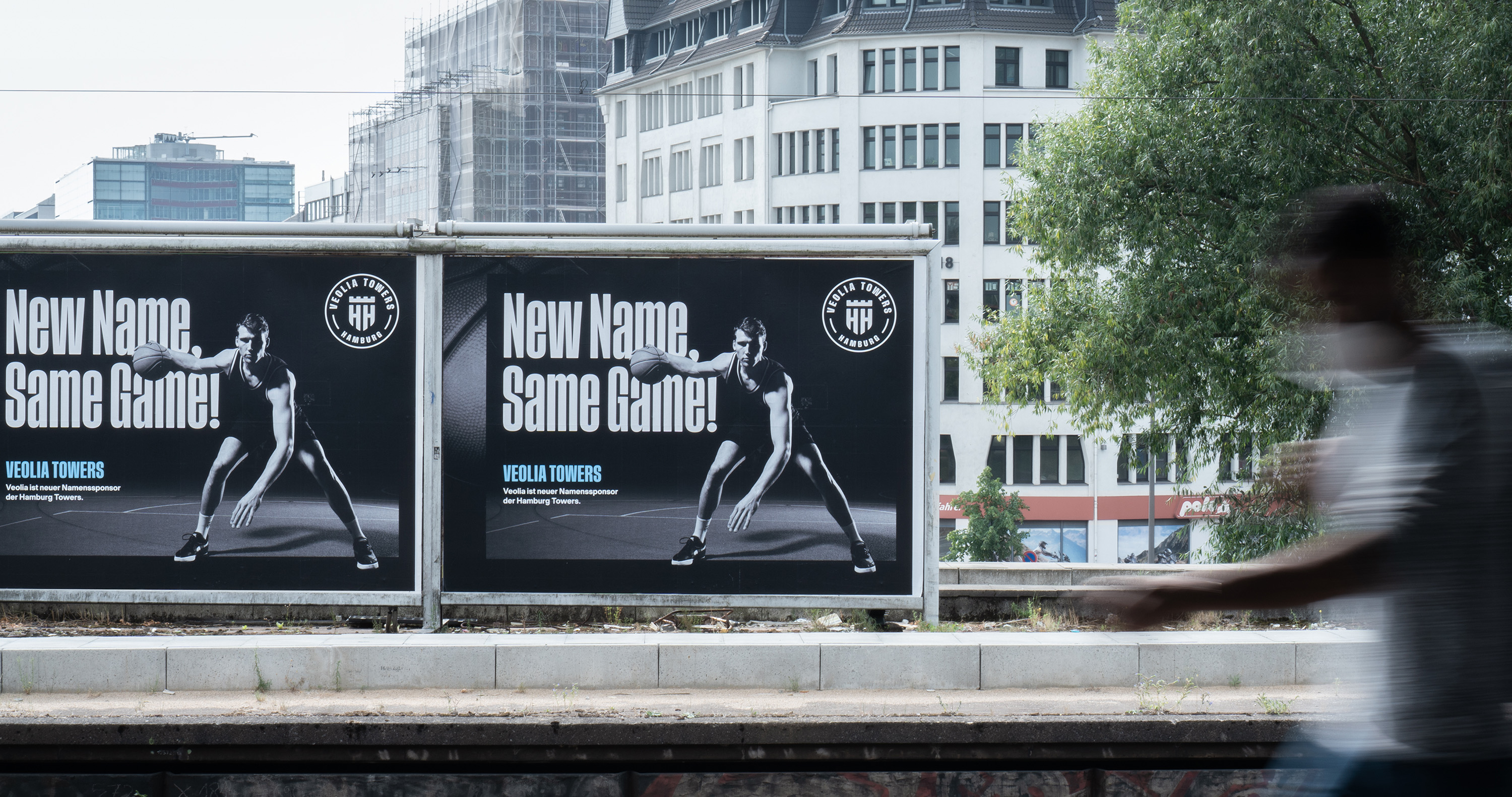
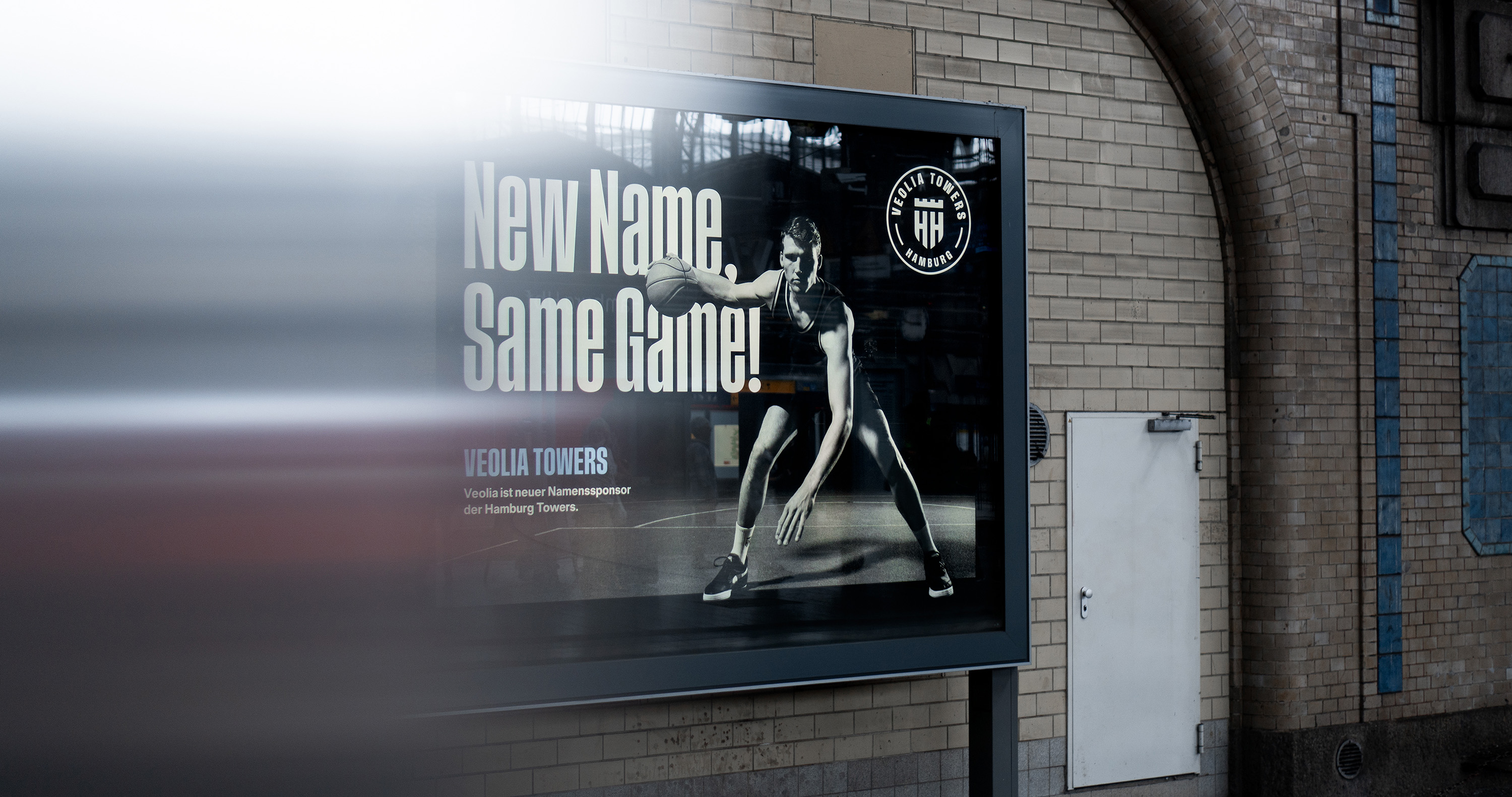
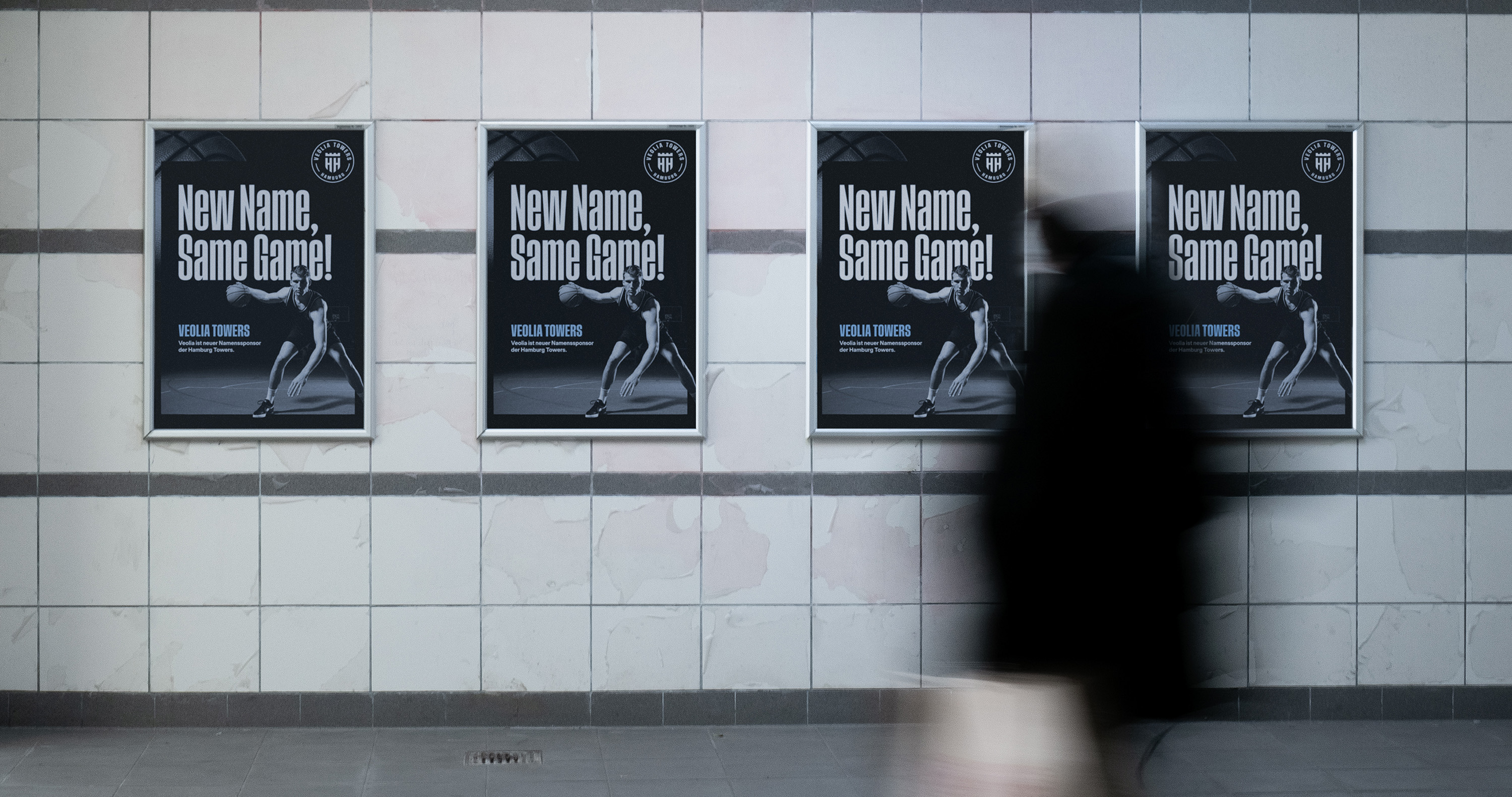
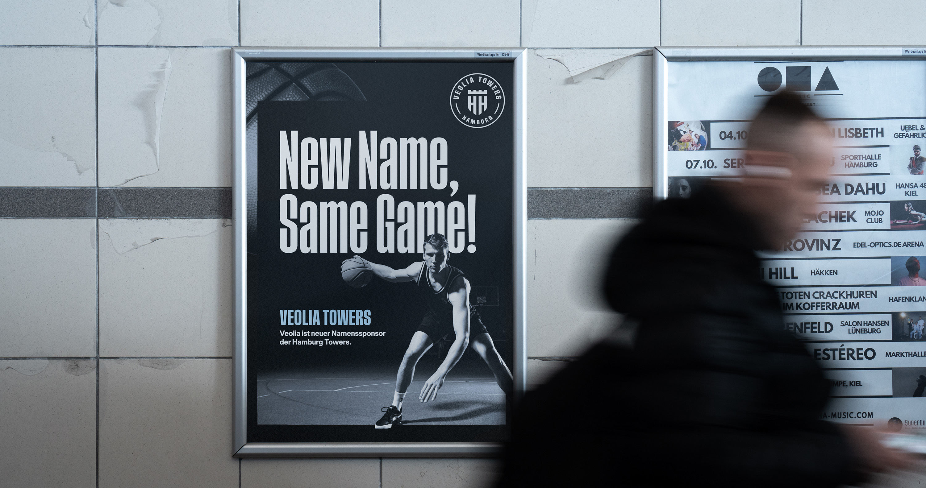
Veolia ist der erste offizielle Namenssponsor der Basketball-Profis des Vereins. Bereits seit 2019 unterstützt das französische Energie-Unternehmen die Towers als Exklusiv- und Umweltpartner und übernimmt in Zukunft mehr Verantwortung.Um die neue Partnerschaft visuell in die Stadt zu tragen, wurde im Rahmen des neuen Brandings ein Keyvisual erarbeitet, was sich auf allen großflächig ausgespielten Medien wiederfindet. Der Claim „New Name, Same Game!” unterstreicht, dass die Kernwerte des Vereins in der neuen Partnerschaft weiterhin Bestand haben und gelebt werden.
Veolia is the first official naming sponsor of the club’s professional basketball team. The French energy company has supported the Towers as an exclusive and environmental partner since 2019 and will take on greater responsibility in future. To make the new partnership visible across the city, a key visual was created as part of the new branding and appears across all large-format media. The slogan “New Name, Same Game!” emphasises that the club’s core values remain in place and continue to be upheld under the new partnership.