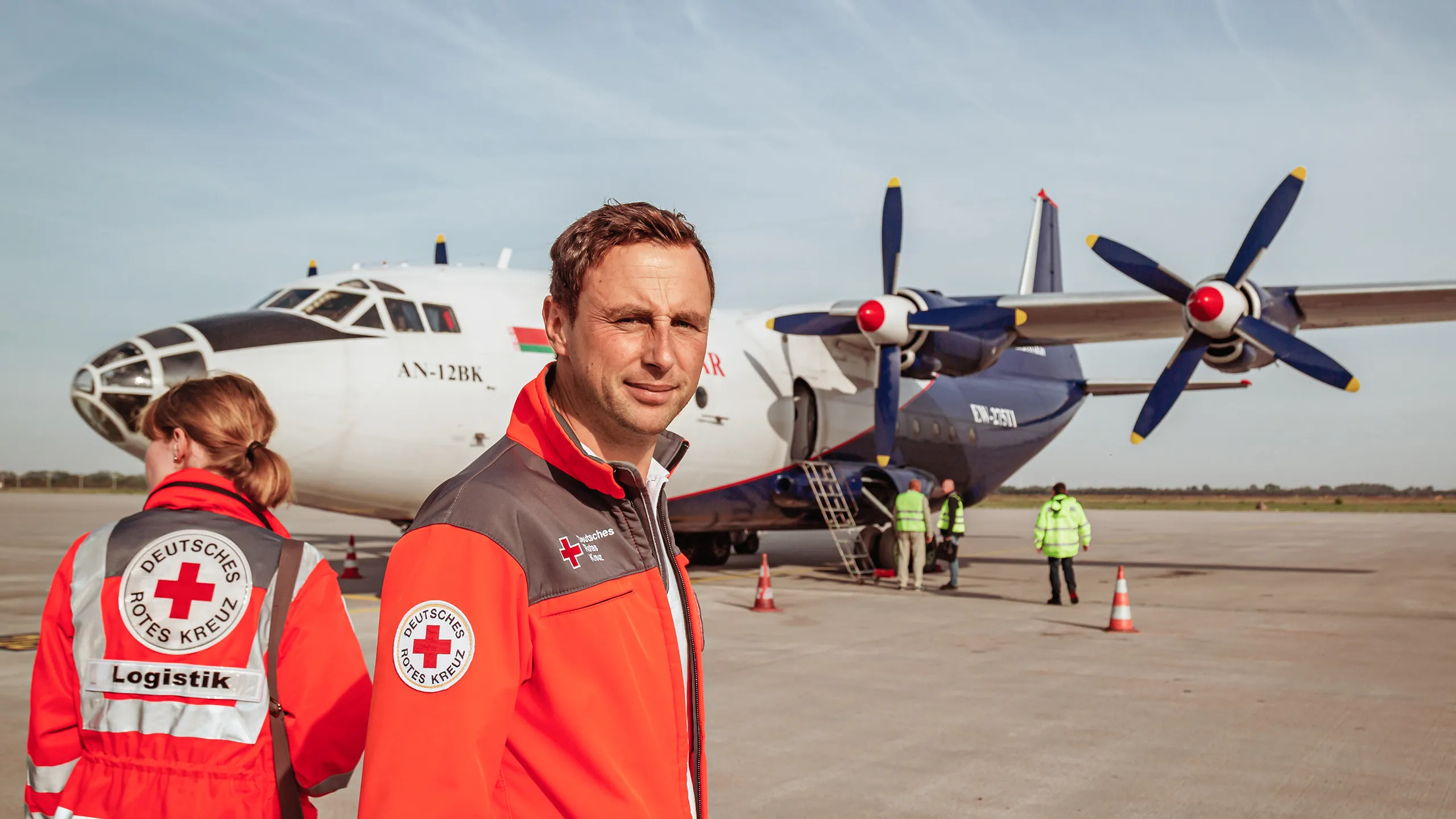
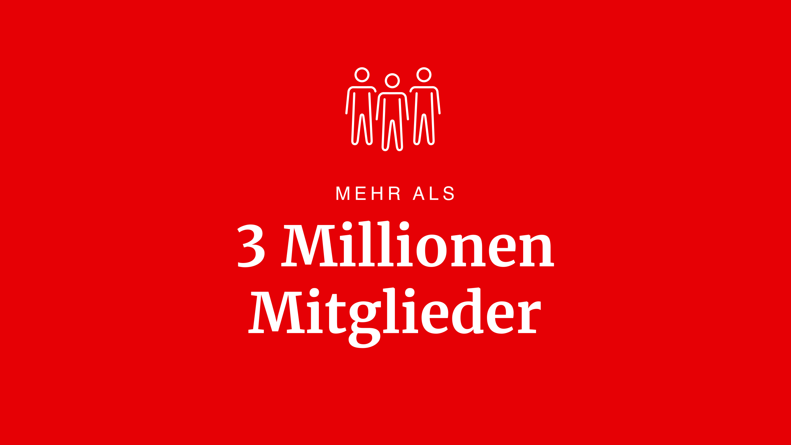
The German Red Cross is part of the world’s largest humanitarian organisation: the International Red Cross and Red Crescent Movement has around 3.2 million members in Germany alone. Over more than eight years of collaboration, a redesign, an online style guide, yearbooks and countless print and digital publications have been produced.
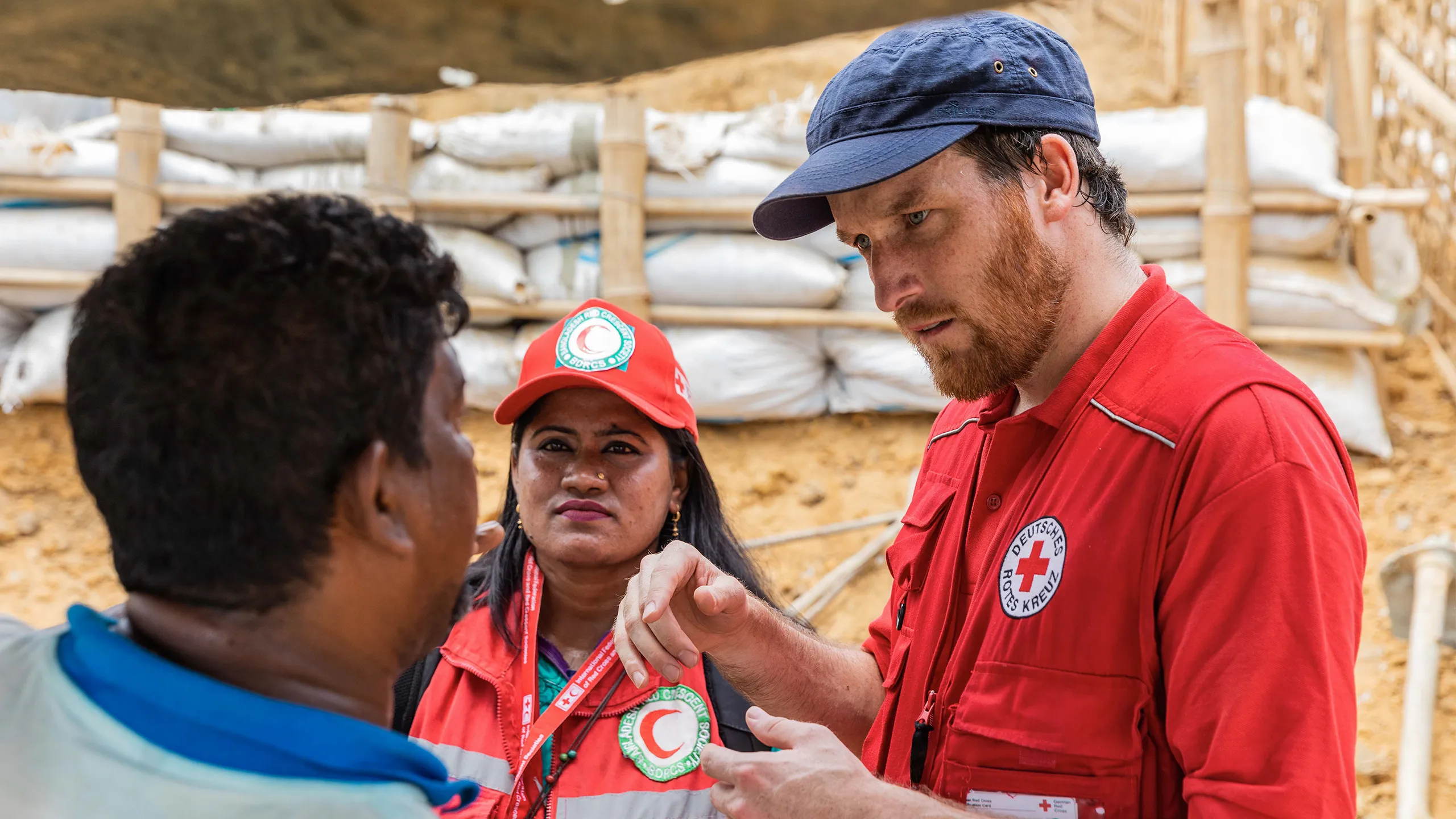
The German Red Cross is a federated organisation with regional influence, whose member organisations and facilities enjoy far-reaching autonomy. This makes an overarching brand strategy all the more important: it lays the foundations for practices, actions and interactions across the German Red Cross. This refined brand strategy was developed collaboratively and visualised in a strategy document.



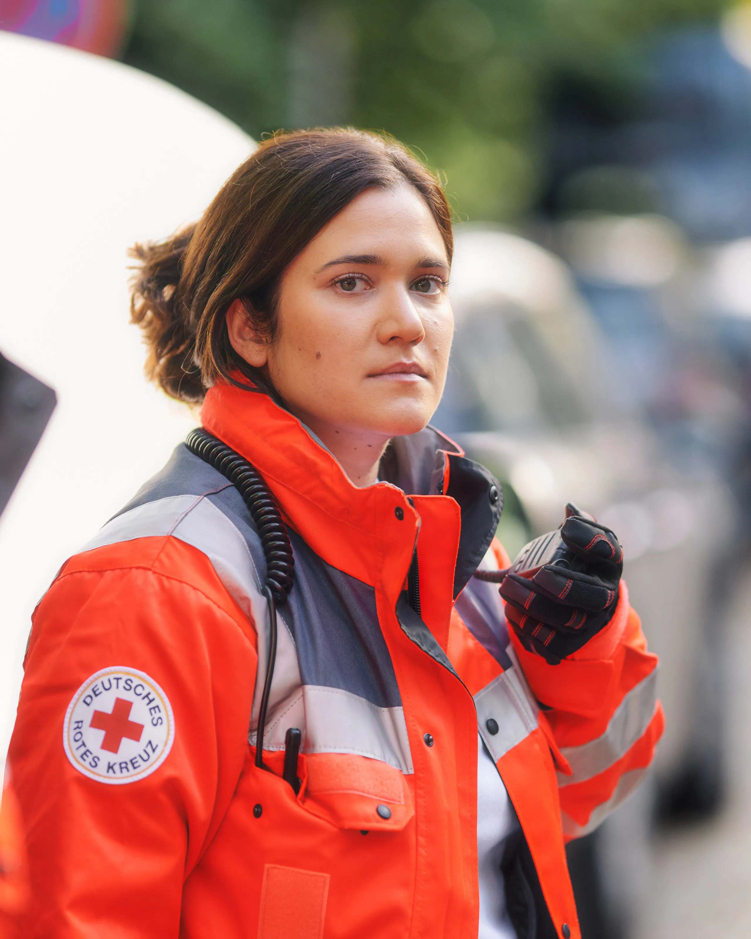




No other organisation has a symbol and a name so closely intertwined. The Red Cross emblem is unique in the world and deserves to be used with dignity. This red cross on a white background has been recognised under international law as a protective emblem in armed conflicts since 1864. It is therefore one of the oldest logos in the world.
As an emblem, it also symbolises hope and humanity for all victims of war and disaster, as well as for the most vulnerable members of society.
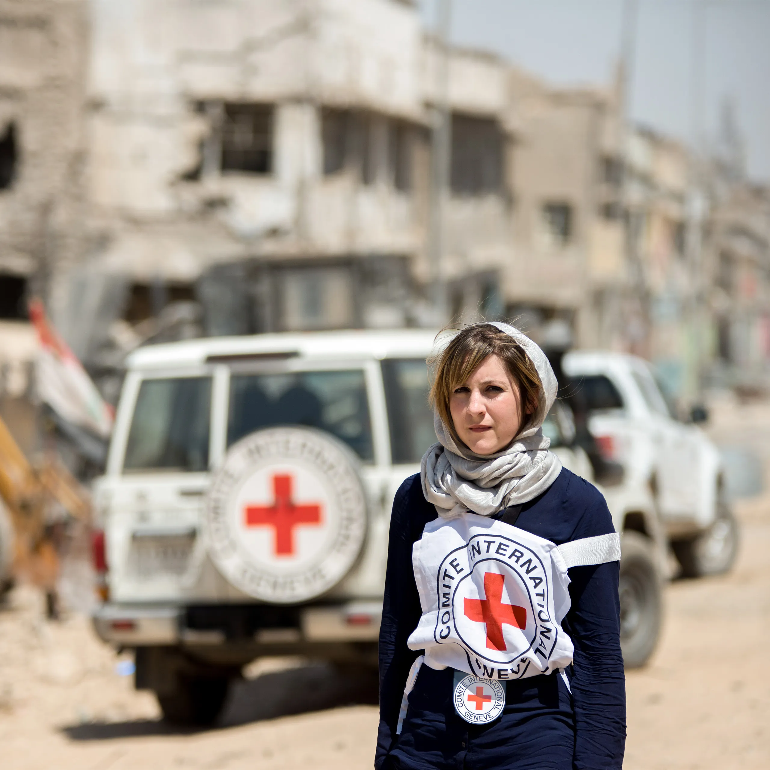
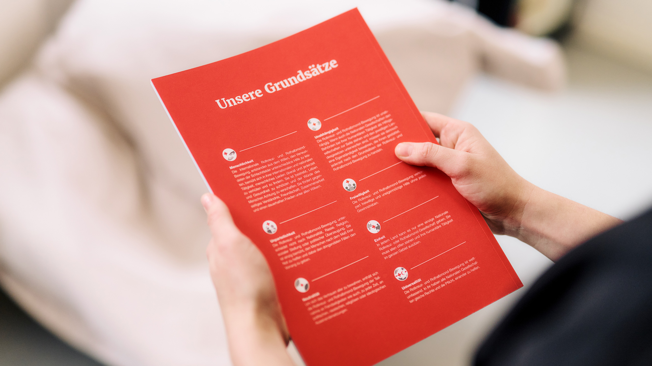
The German Red Cross has a wide range of services and responsibilities. For this reason, a modular design system was developed for use across all its areas of work and associations. A distinction is made between internal, external and special publications. These three design strands form the German Red Cross’s overall design concept.
Red is positioned as the primary colour, supported by a consistent visual language and iconography.
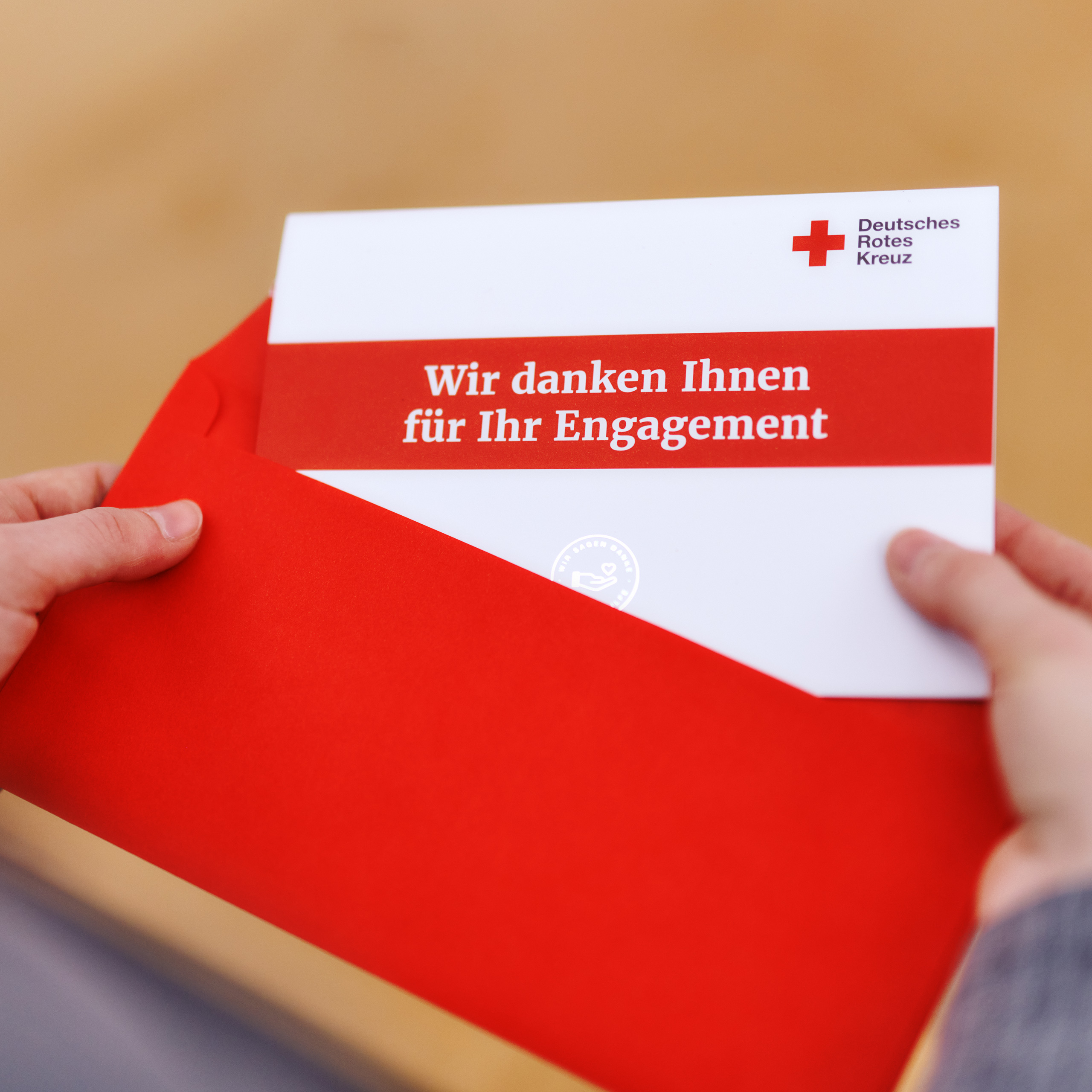
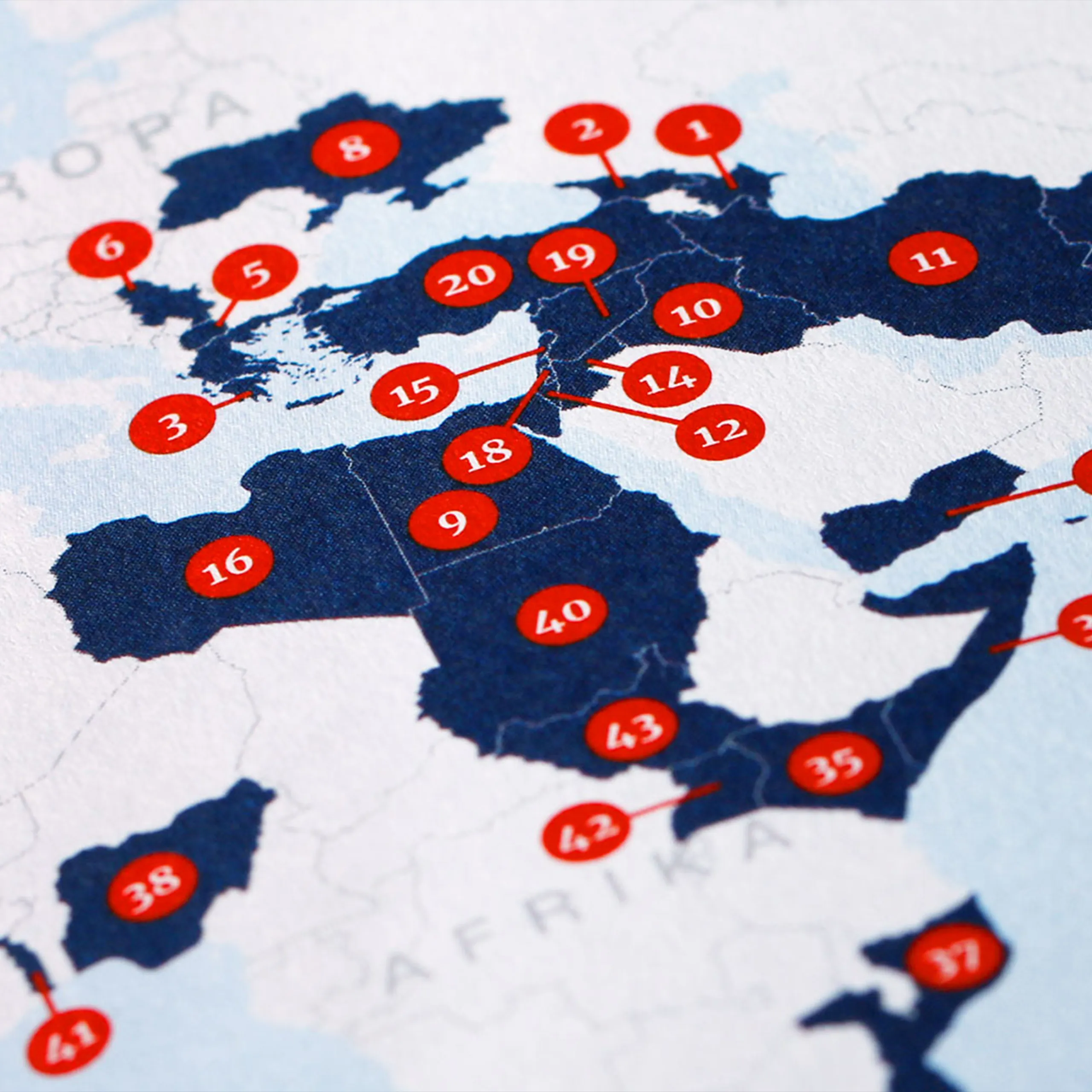
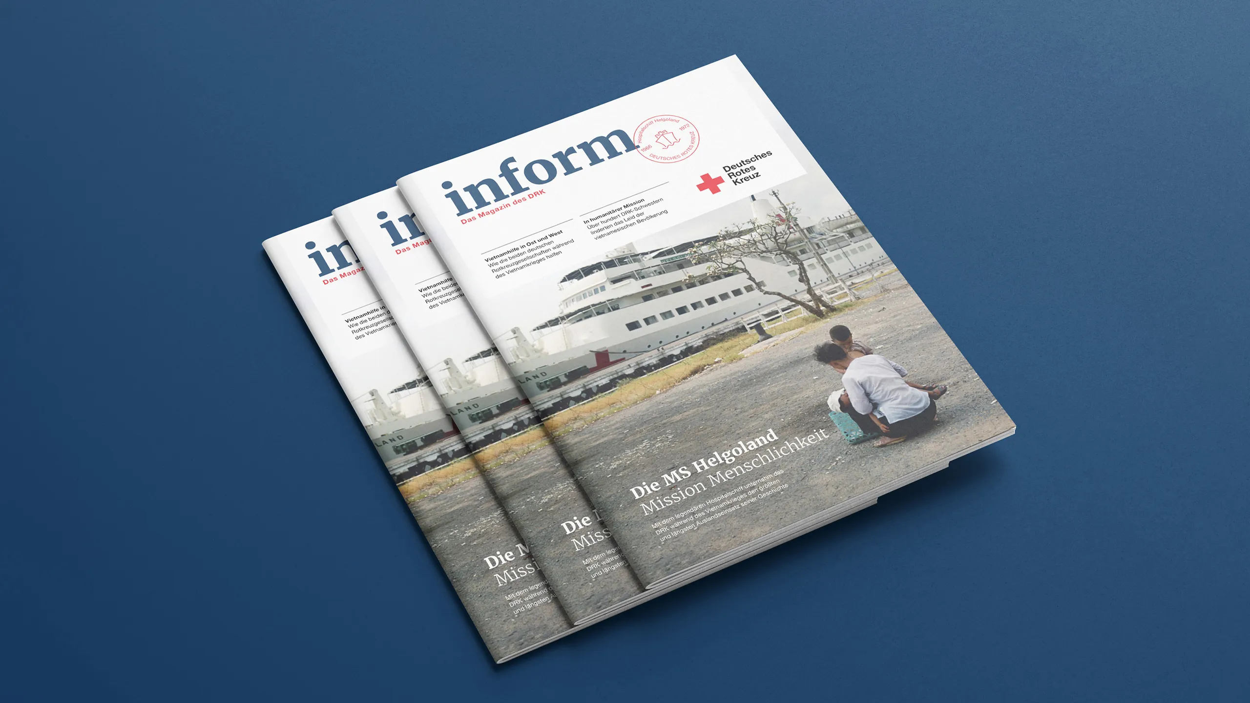
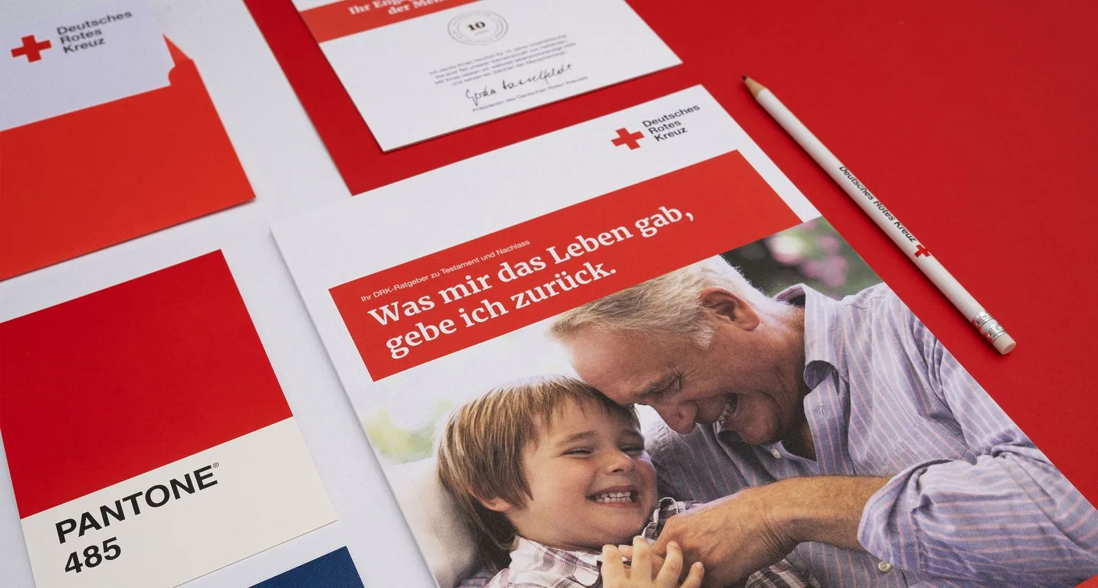
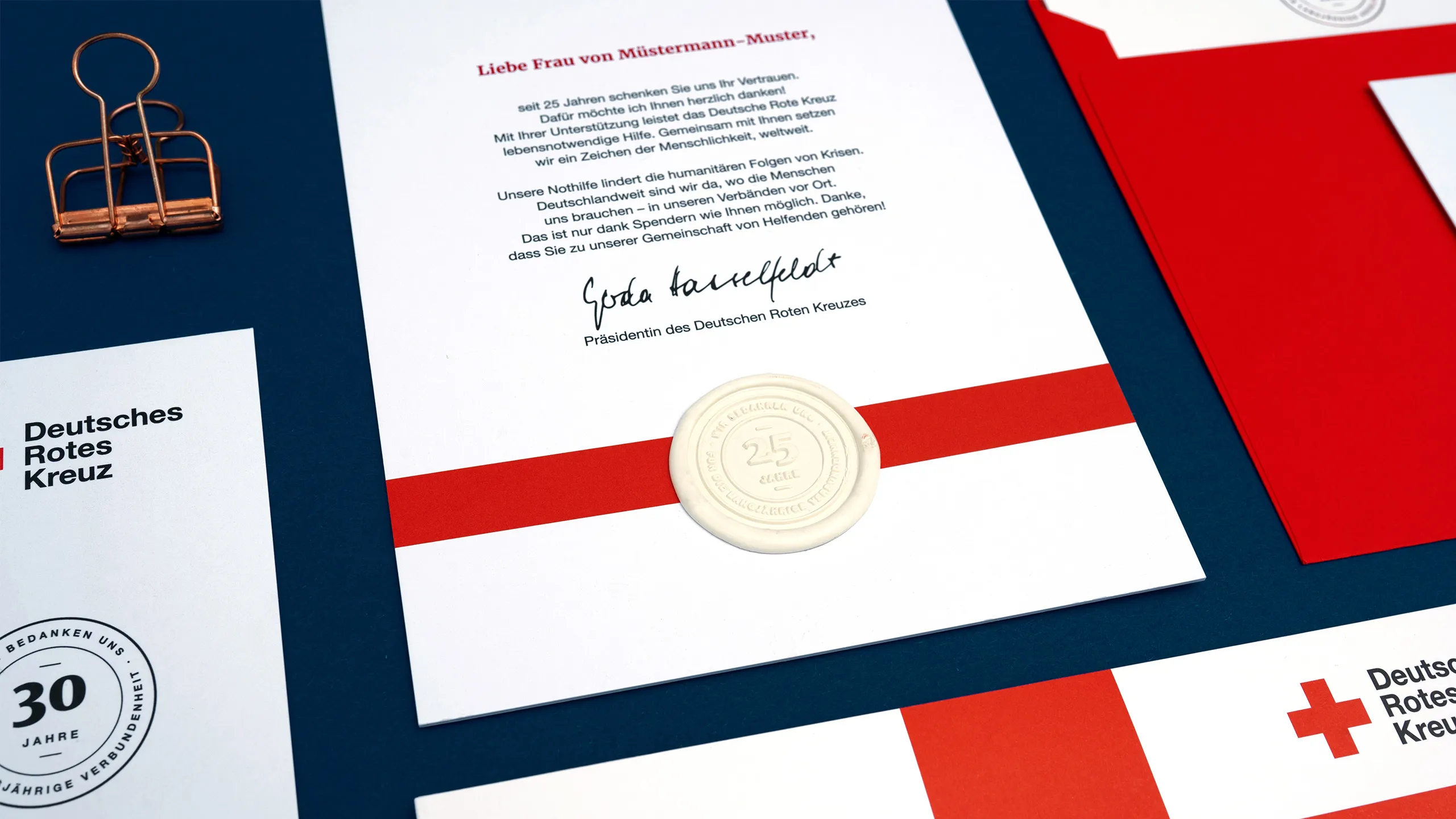
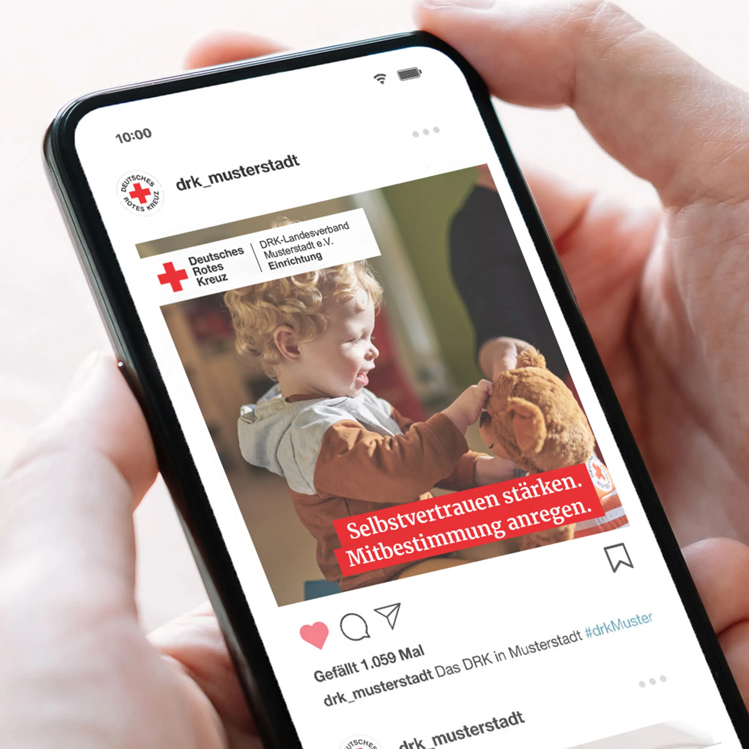
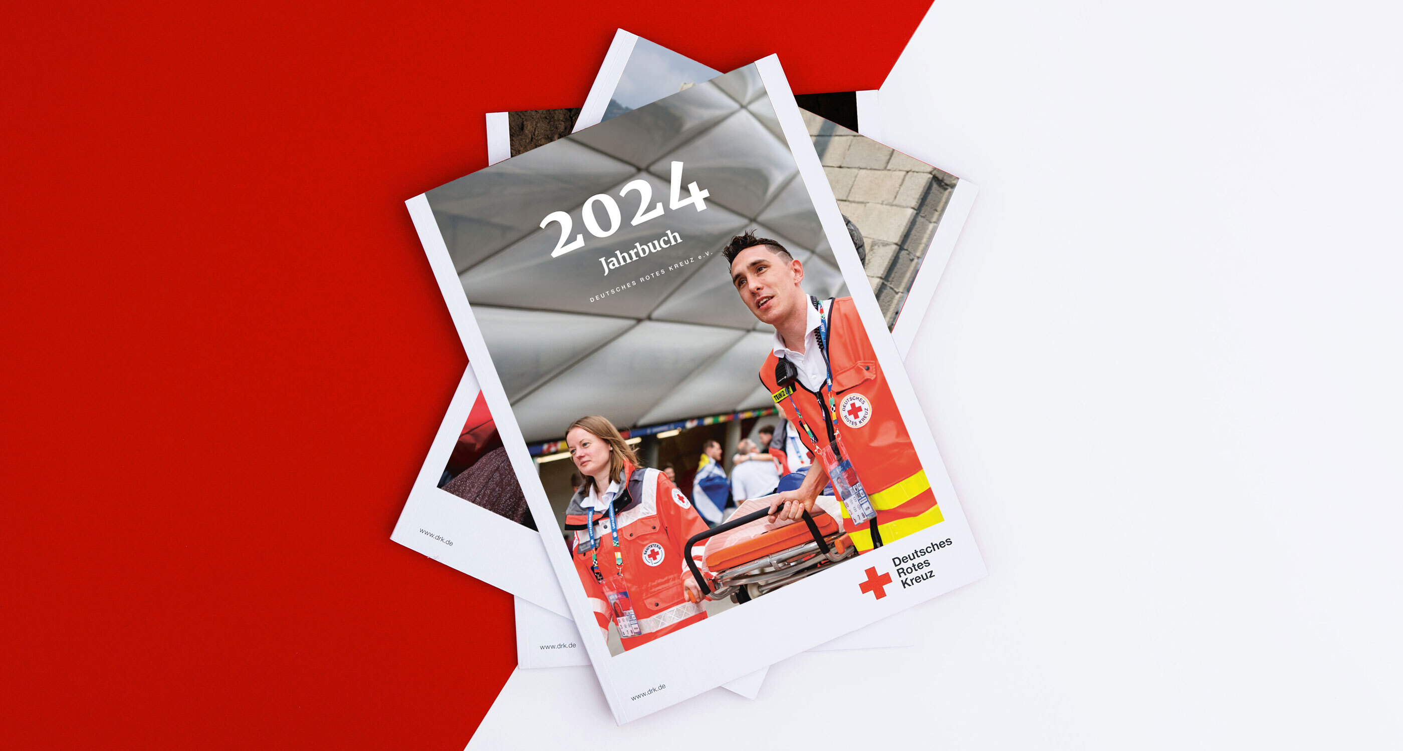
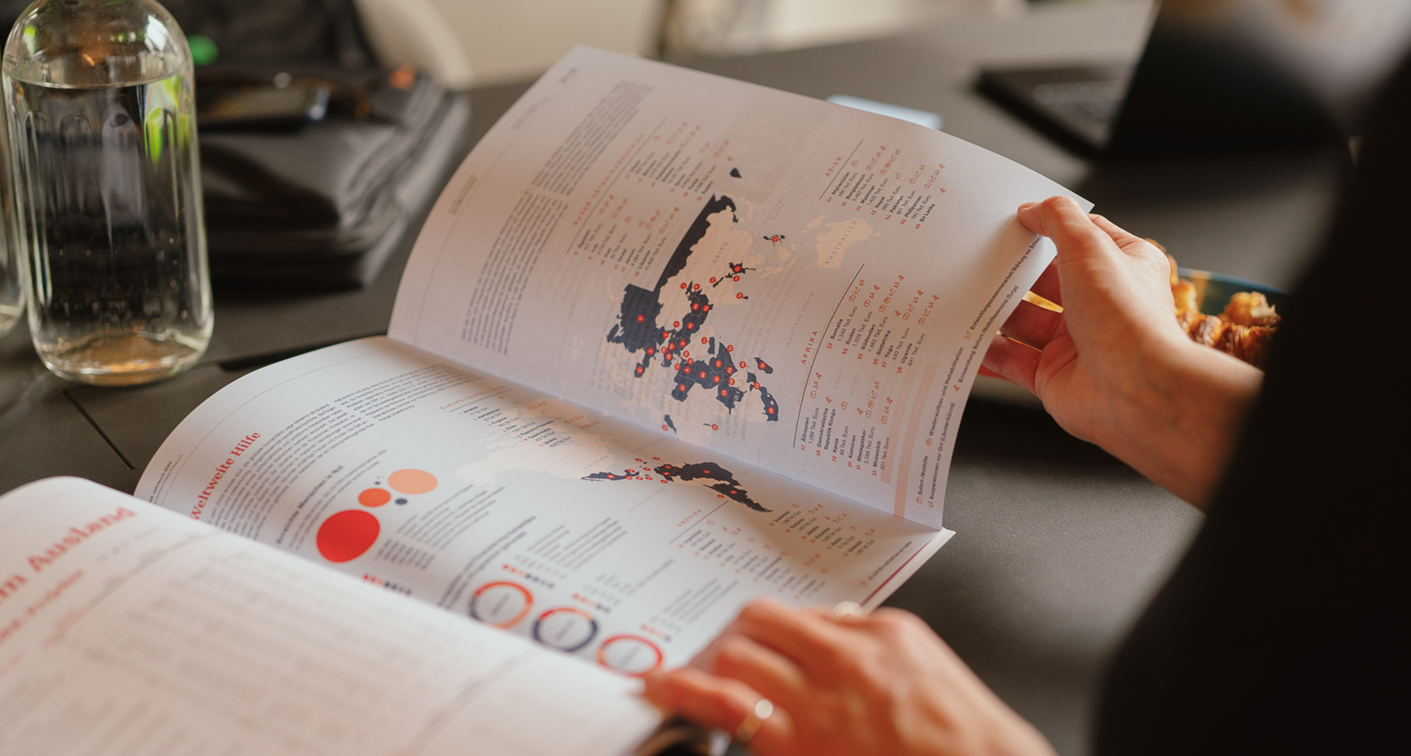
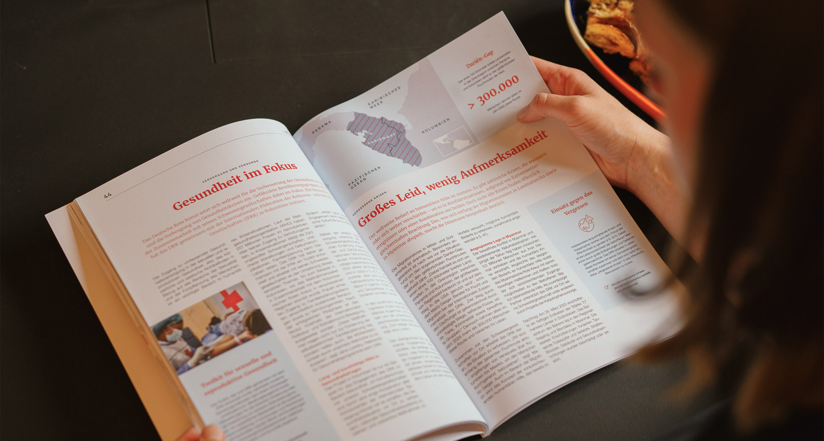
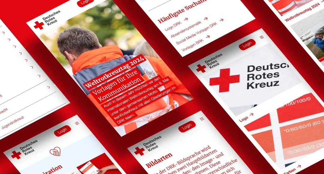
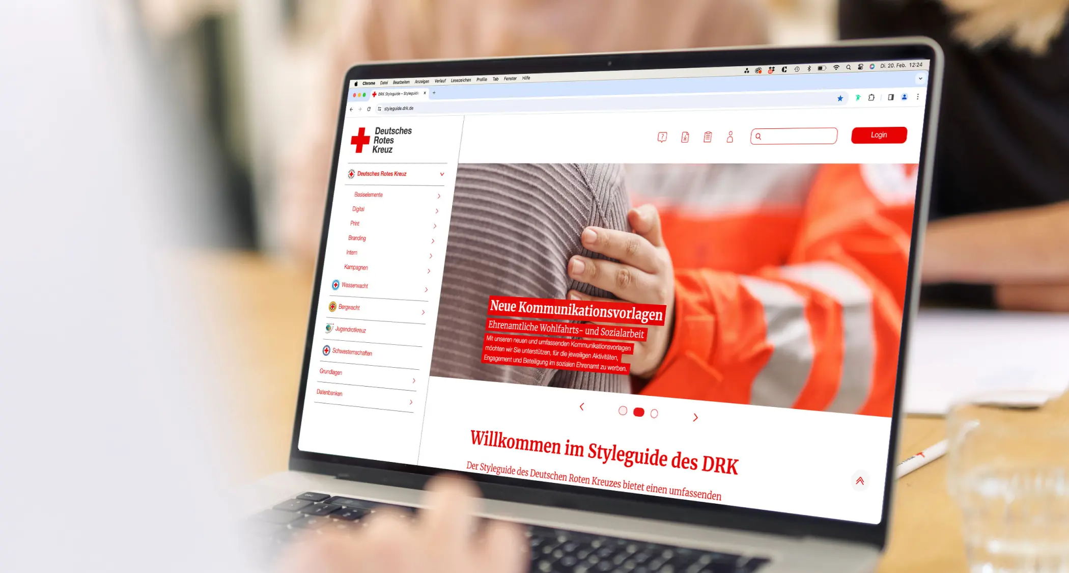
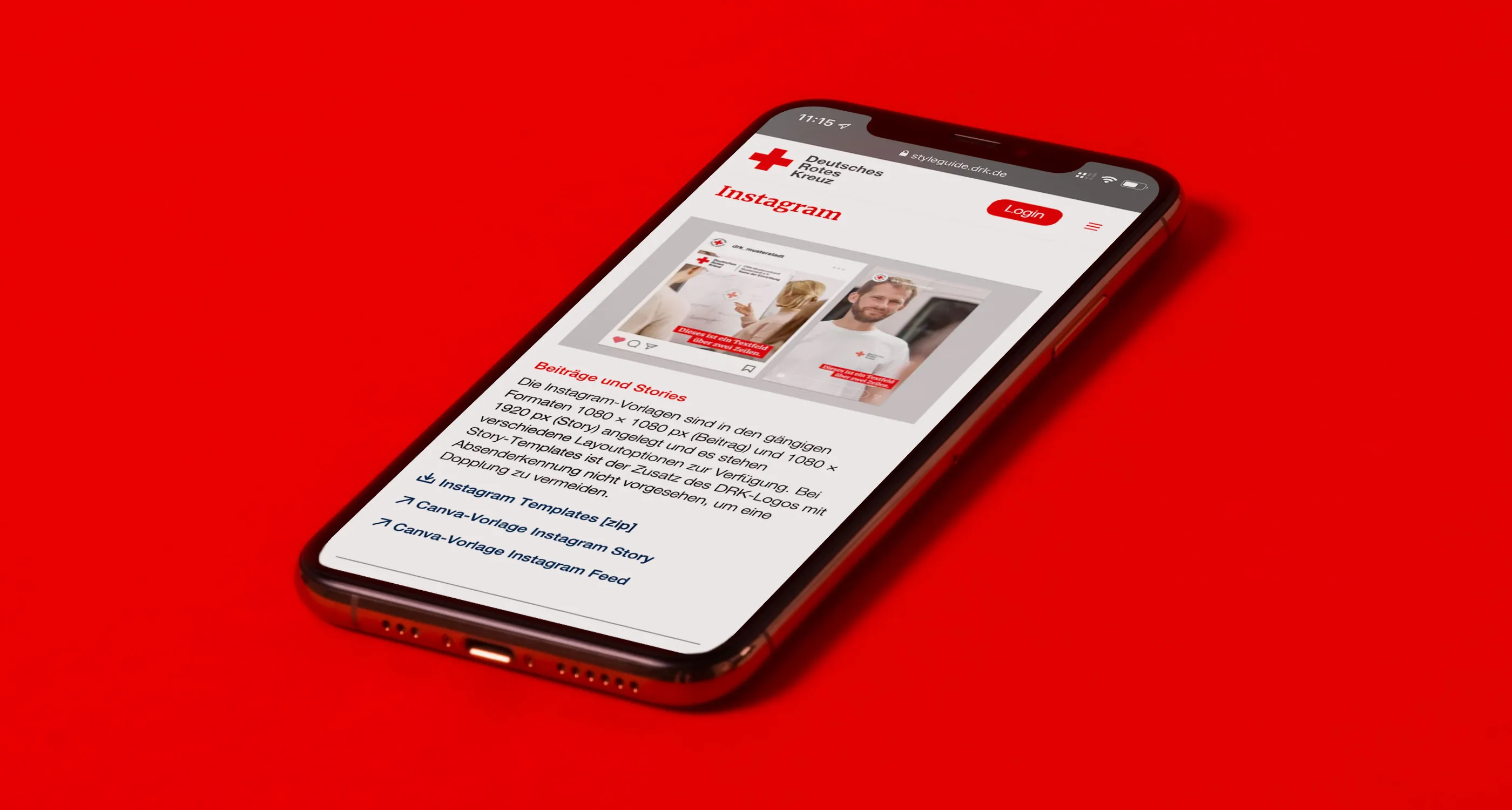
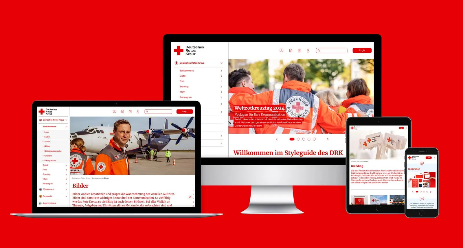
To ensure that all members and staff, both paid and voluntary, can access the guidelines and templates, an online style guide has been developed that covers both the core elements and a range of offline and online media. This dedicated platform enables ongoing brand management and brings the visual identity to life.
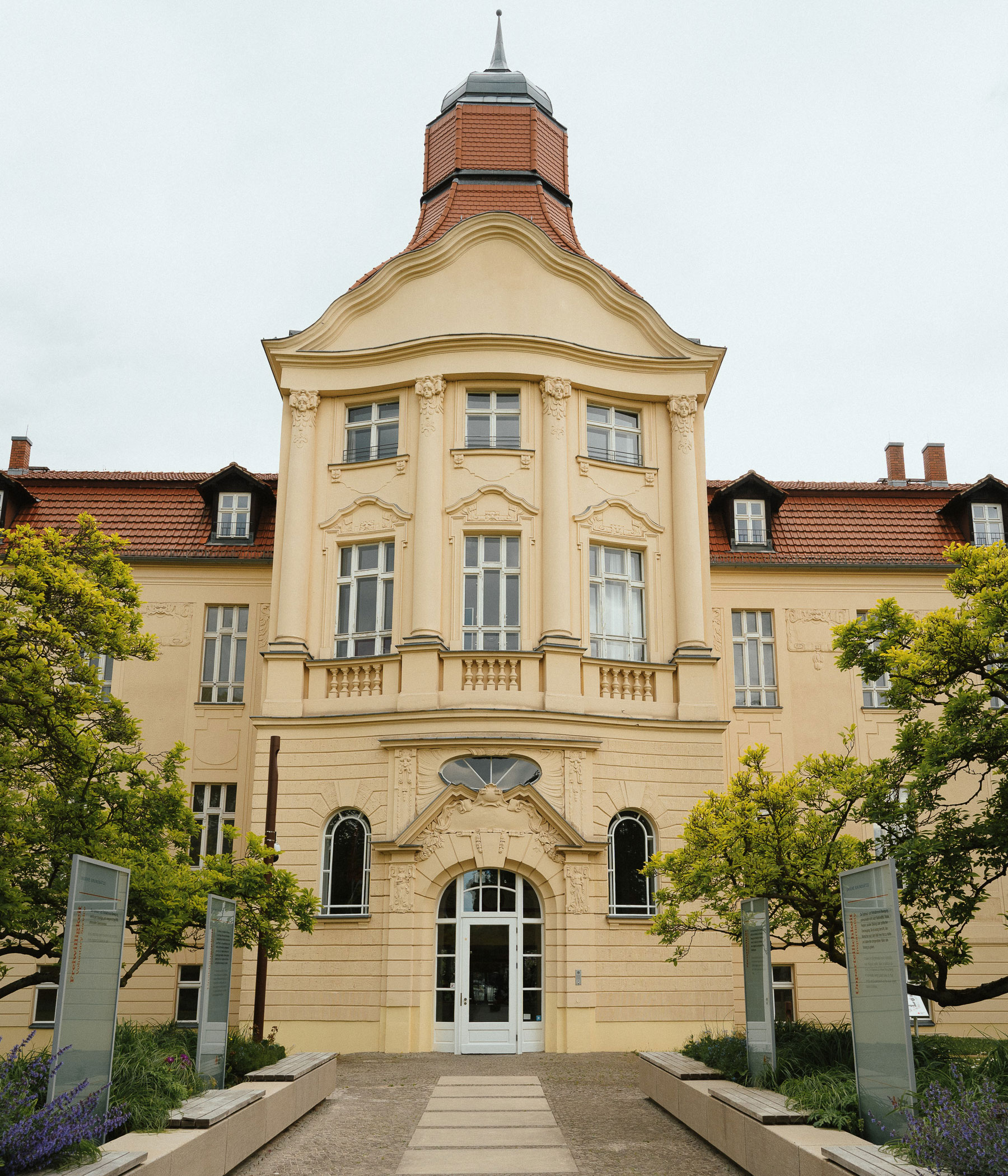
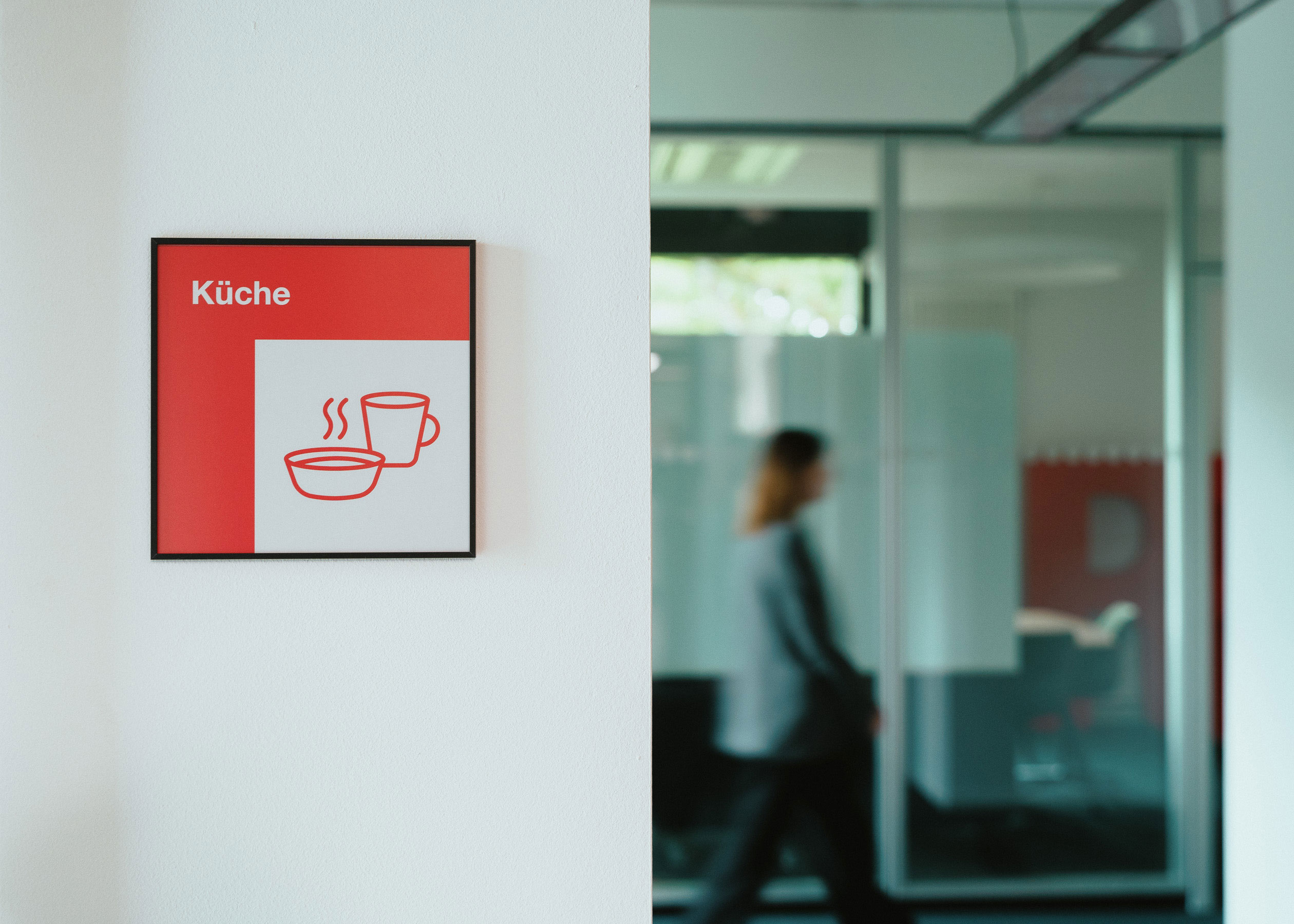
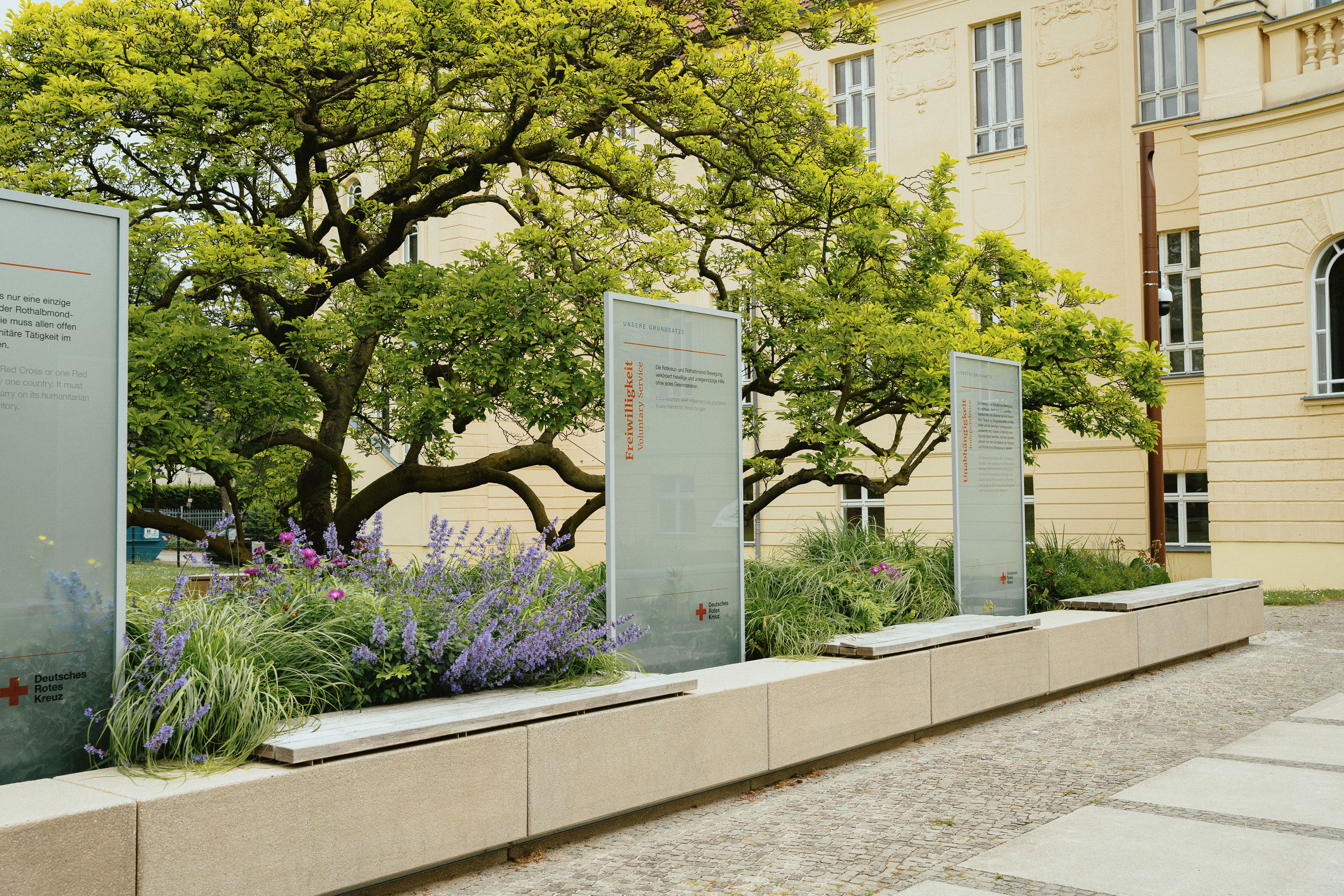
A new wayfinding system has been developed for the German Red Cross General Secretariat in Berlin, helping staff and visitors find their way. It was prompted by the addition of a modern extension to the historic main building, which created new routes and entrances.
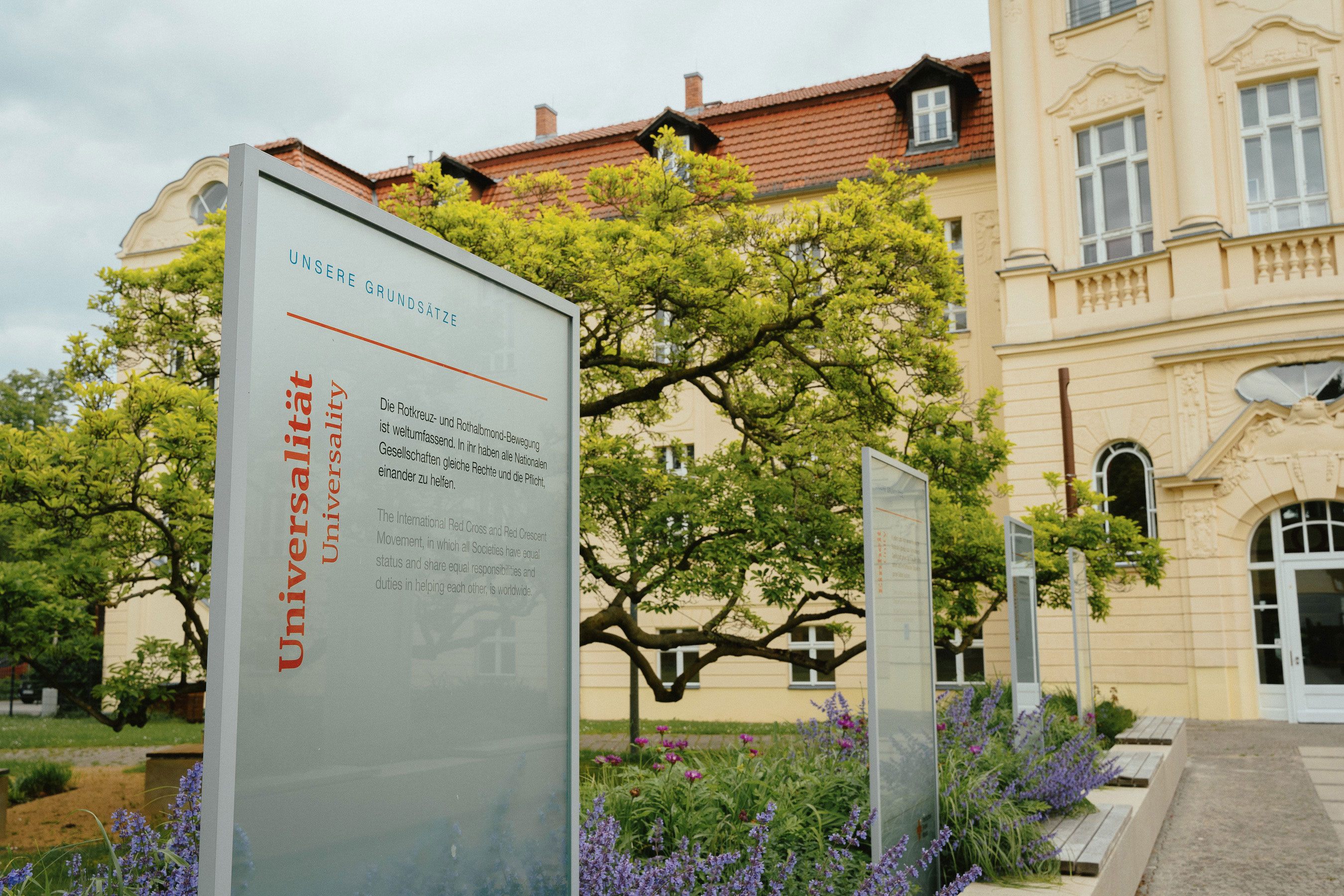
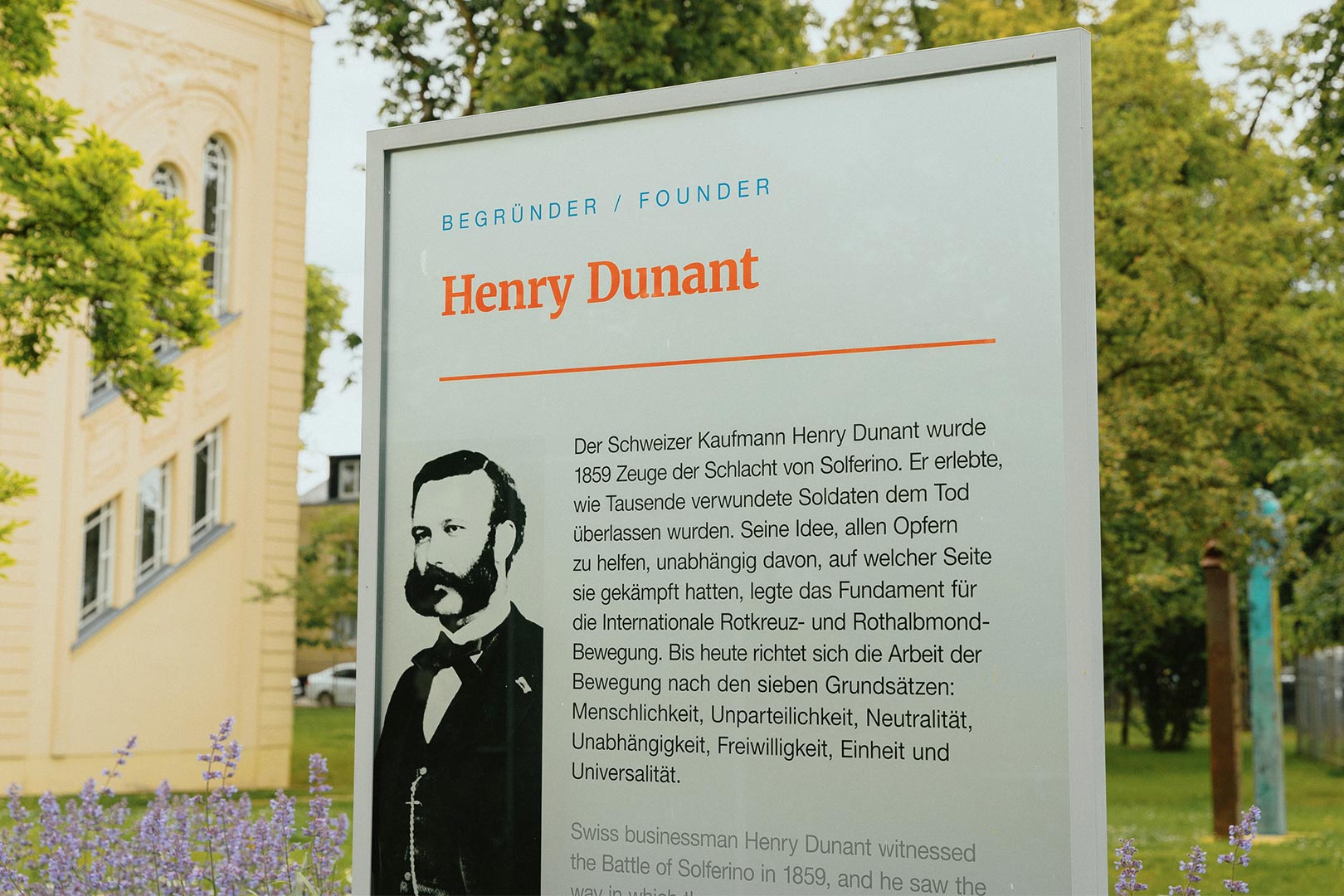
The wayfinding system inside the building is derived directly from the cross in the logo. Part of this distinctive symbol forms the basis of the design, dividing it into red and white areas. This principle allows the design to be adapted flexibly to different formats. At selected points in the building, the two areas form overlapping layers, giving the design a sense of quality and three-dimensionality.
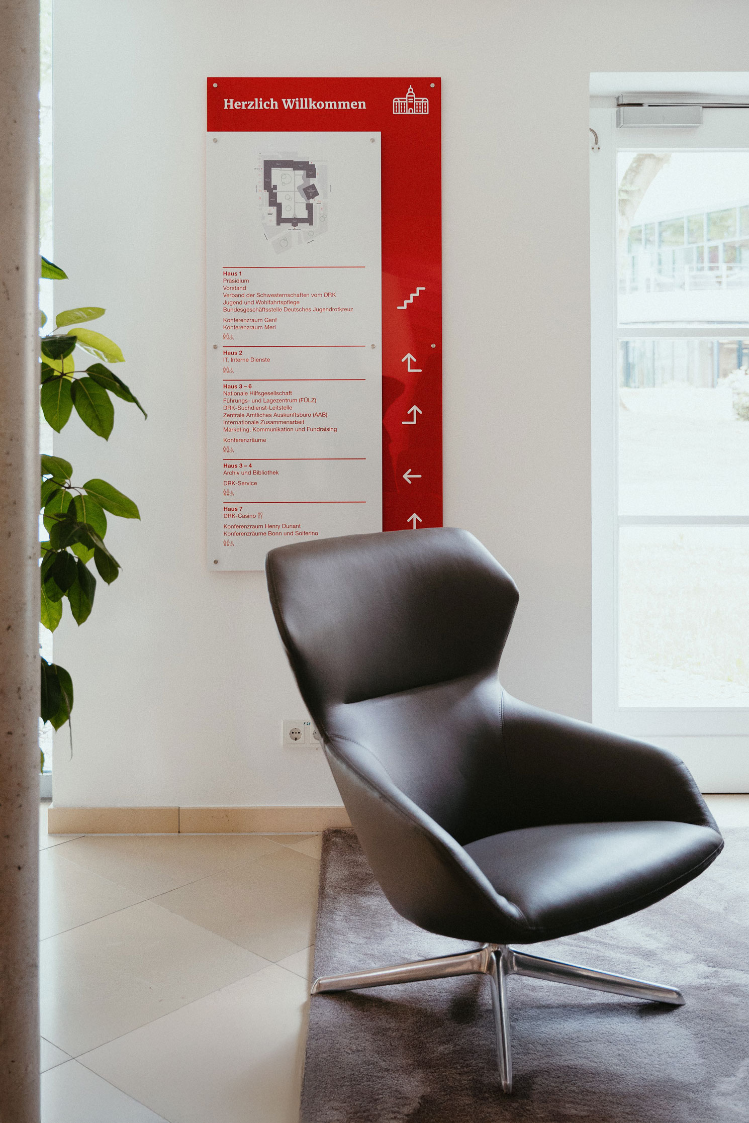
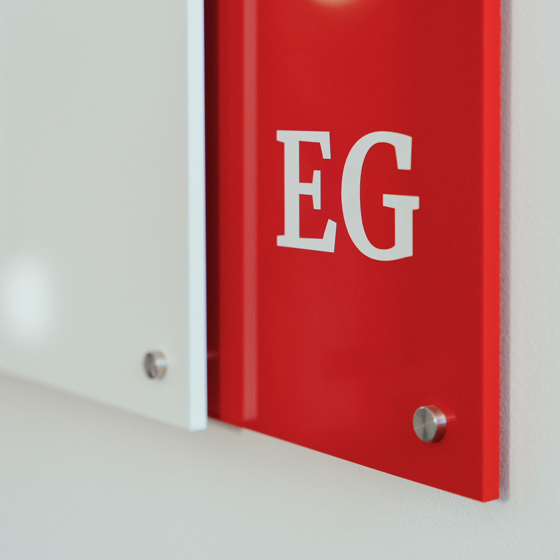
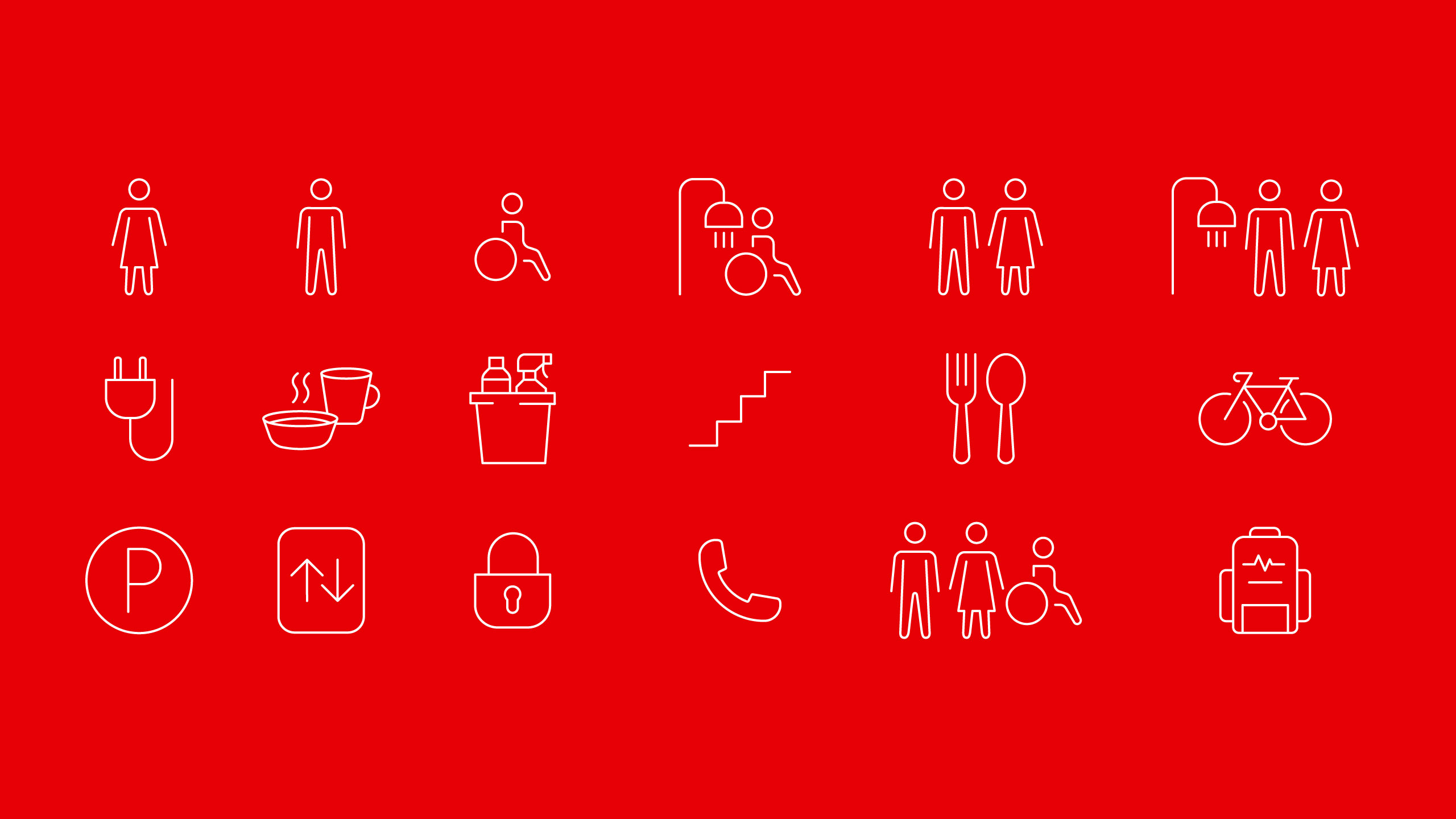
The wayfinding system is supported by the use of icons, which help staff and visitors find their way easily. The icons are derived from the DRK’s existing line-based icon style.